Data
- Location
- *Tokyo, Japan
- Team
- Megumi Matsubara, Hiroi Ariyama
- Completion year
- 2007
- Client
- Timberland Japan
- Purpose
- Interior design for a retail space
- Floor area
- 199 sqm
- Photographers
- Sebastian Mayer
- Acknowledgement
- Kohji Watanabe, Goro Sugishita
- Notes
- *Now closed permanently.
Our intention was to create “Timberland’s Forest” in Shibuya, that represents “Urban Forest Environment” where people, urban life, nature, and sourceful information about quality life and environment meet.
“Recycle & ecology” was Timberland’s renewed global concept, and Shibuya Concept Store was going to be the fourth new concept store in the world after London, Singapore and Milan. We were commissioned by Timberland Japan to design the interior concept that fits this new global concept, but at the same time that goes beyond their concept and matches and attracts the local young people in Shibuya.
To communicate the theme of “recycle & ecology” with the young audience in Shibuya, we created a whole story. The store is explained by three areas; “Forest” as conceptual symbol, “Cottage” as the brand’s home, and “Workshop” as its linkage to industry. When entering the store, visitors walk into the forest that suddenly appears in Shibuya. There were also three guiding concepts to attempt which were to “be educational”, “present local solution”, and “present global attitude” through the space.
For the realisation of such ideas, we strictly defined rules like follows throughout the whole process:
– To use materials normally get dumped
– To understand/track the backgrounds of the materials before use and try to find local materials
– To recycle and find use for the scrap pieces produced during the construction
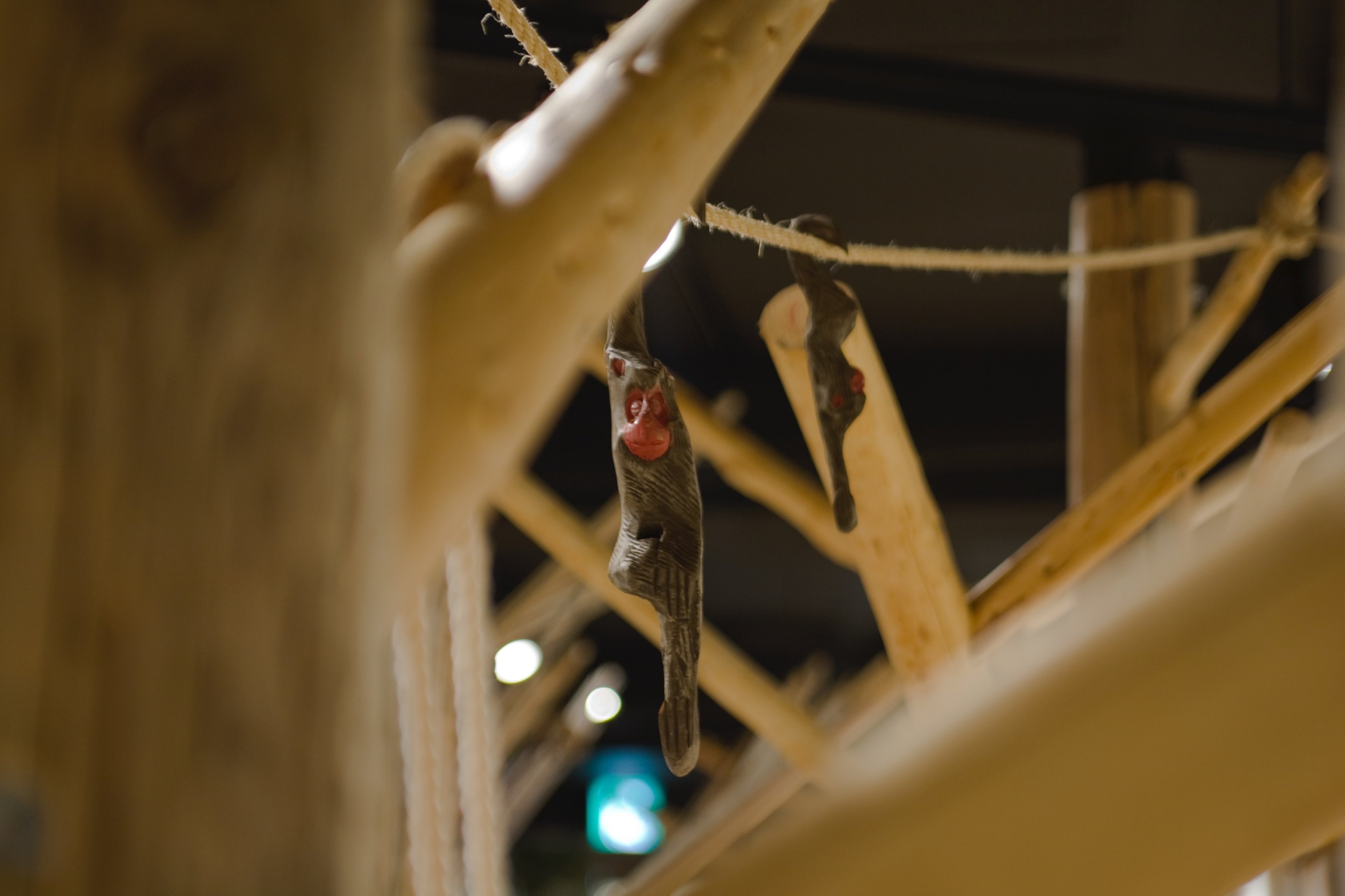
Symbolic trees by the entrance are to trigger environmental education through communication among shop staffs and customers. They are movable along the rails and shop staffs are encouraged to decorate the forest in their own ways. Material-wise, they are built by thinned woods to keep woods healthy or fallen trees after the storm. A few of all are built from scrap wood produced during the construction of the space. Flooring material is recycled wood used as scaffolds for renovation of an old temple in Hiroshima. Those stories will be shared between staffs and between staffs and customers to make the retail store also as “recycle & ecology” communication centre.
Further inside, visitors enter “cottage” area where they find comfort and brand’s stability as well as “workshop” area at the corner that represents brand’s linkage to society through industrial and environmental materials such as wood cement, cardboard, and so on.
The white wall on the left when entering the store is used as “gallery” to communicate more naturally with the susceptible adolescents and draw their attention through artwork ideally curated under the keywords of “recycle & ecology”.
The store’s view should change seasonally by movable trees and decoration in different arrangements like real forest.
We hope our interior concept would catch on in Shibuya influencing the expansion of local understanding on “recycle & ecology” together with the brand and its strong positive attitudes.
Images
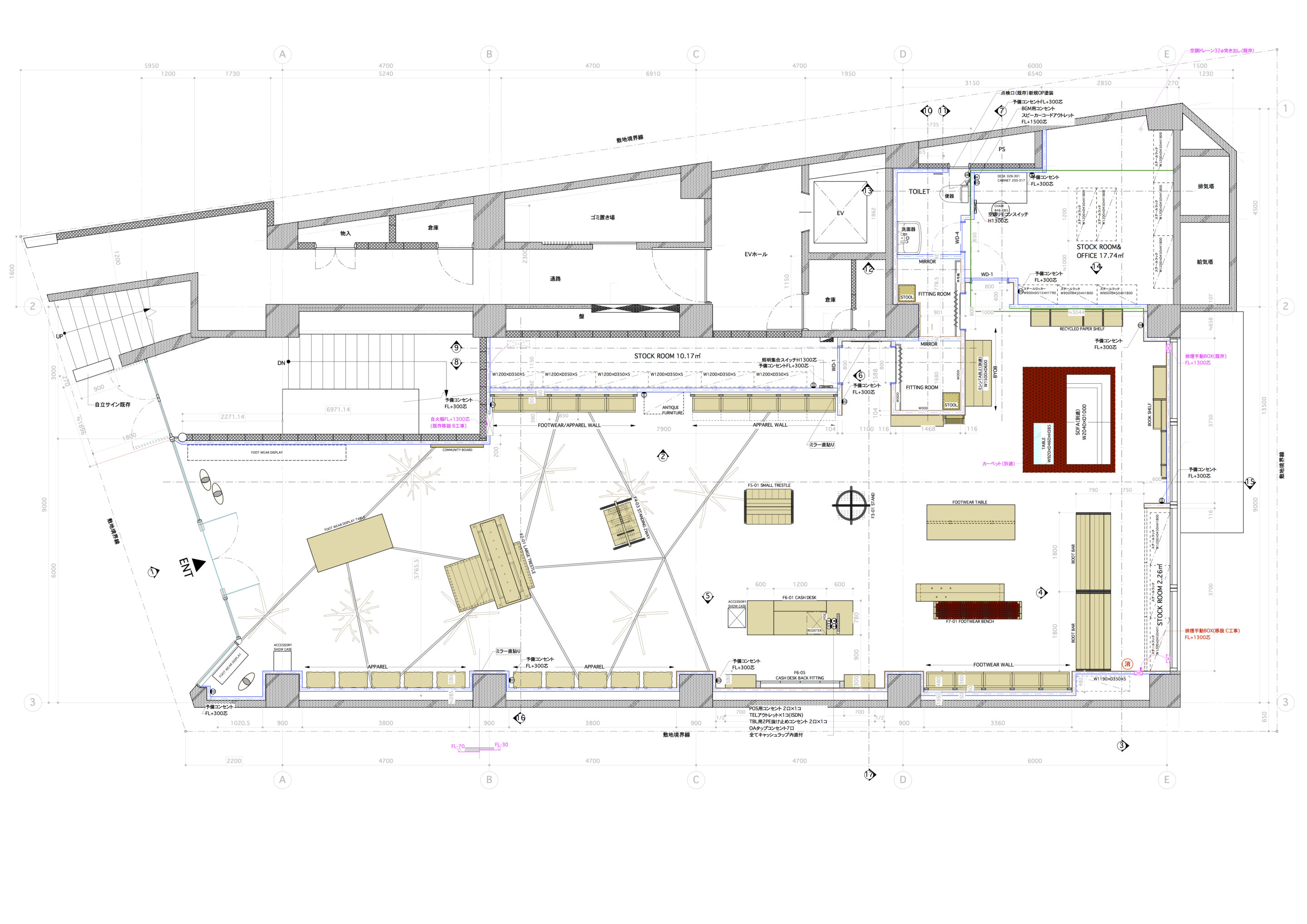
architecture drawing / floor plan
Photo © ASSISTANT
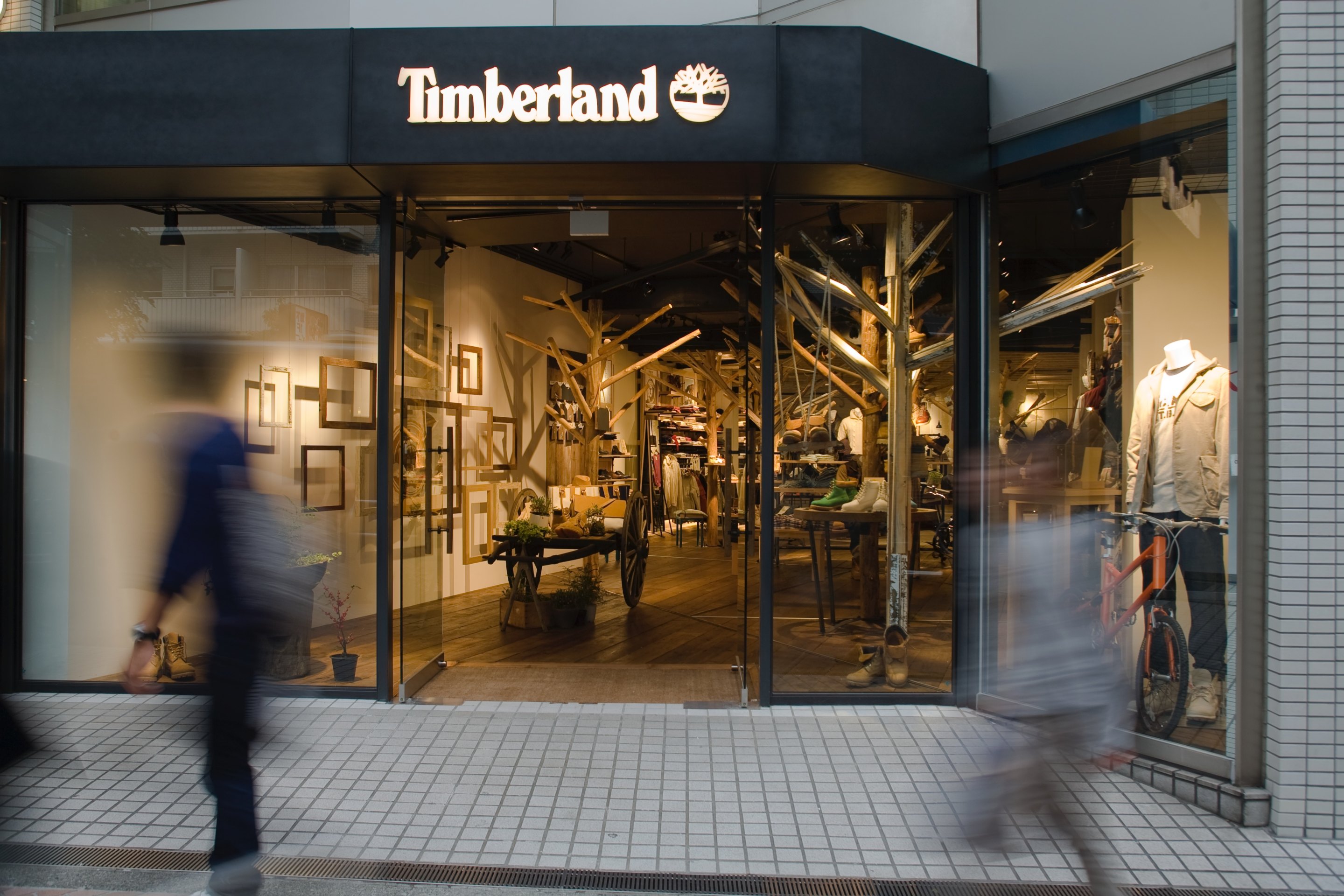
Photo © Sebastian Mayer
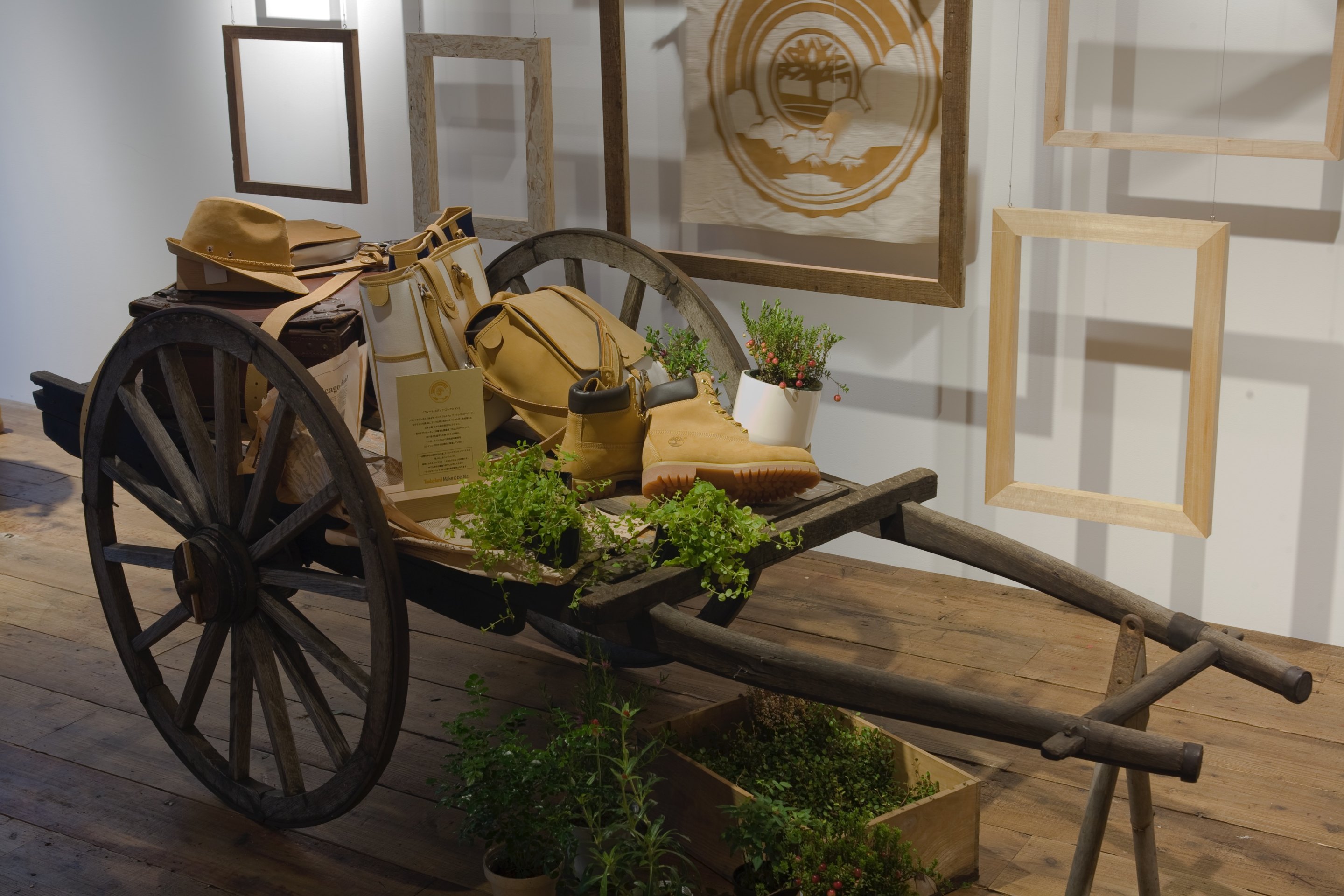
Photo © Sebastian Mayer
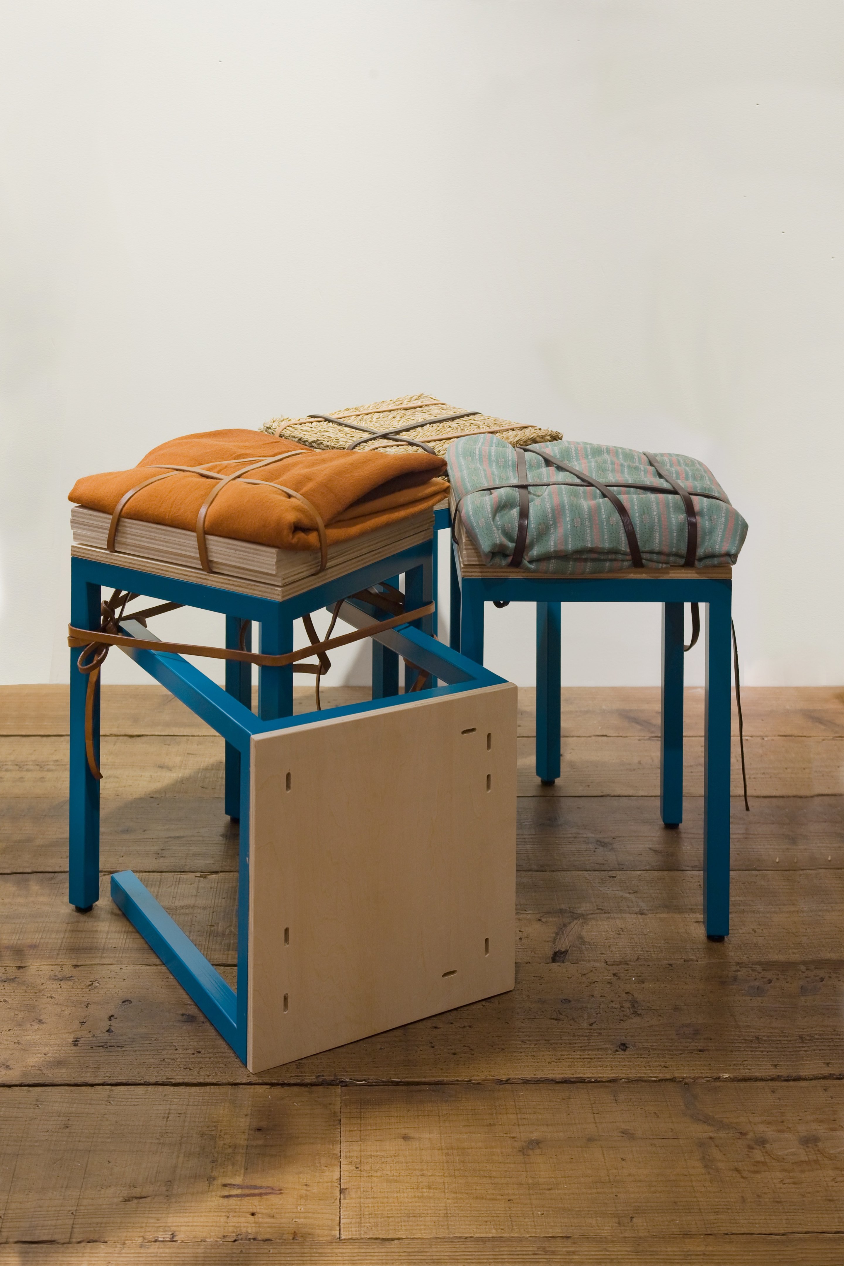
Photo © Sebastian Mayer
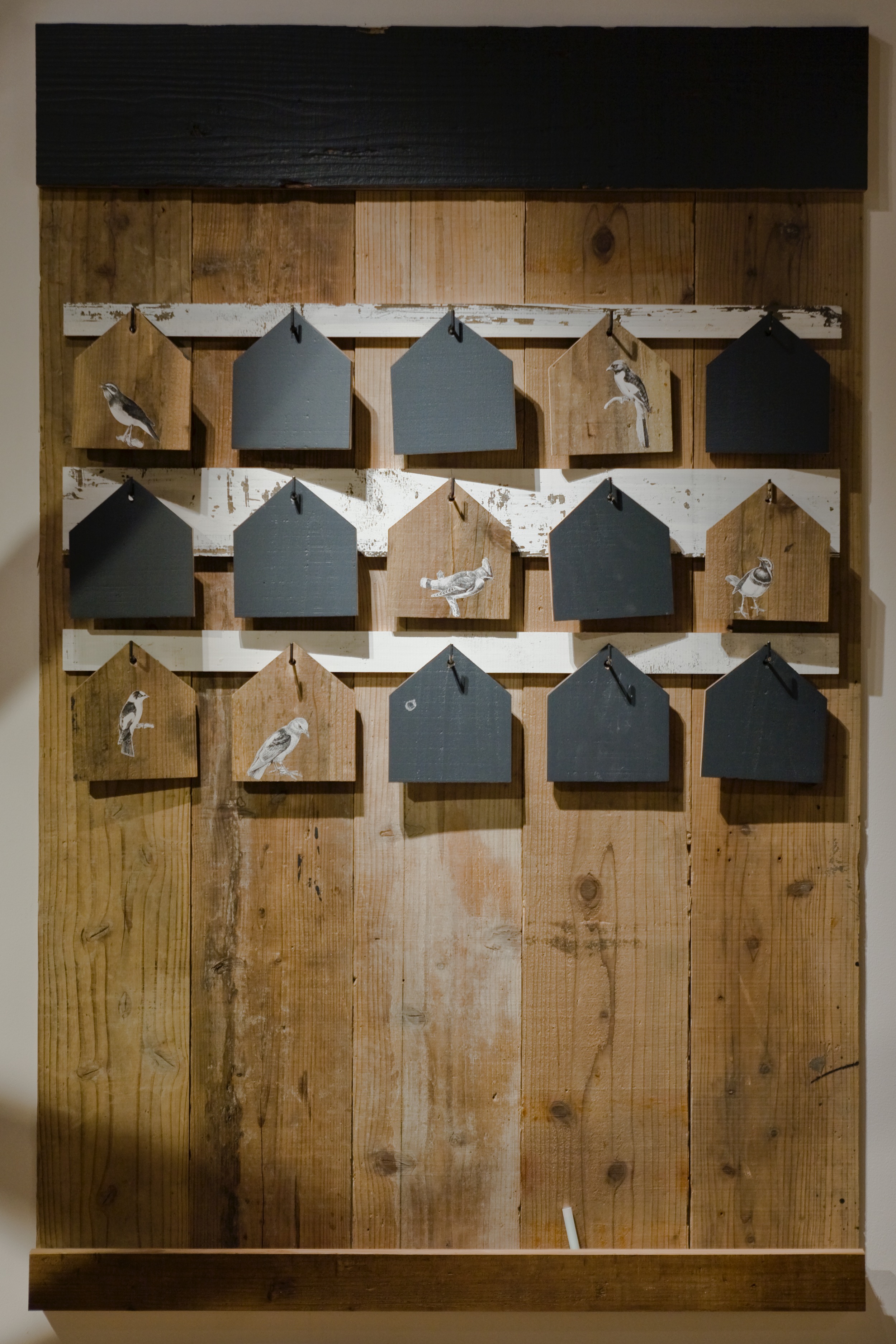
Photo © Sebastian Mayer
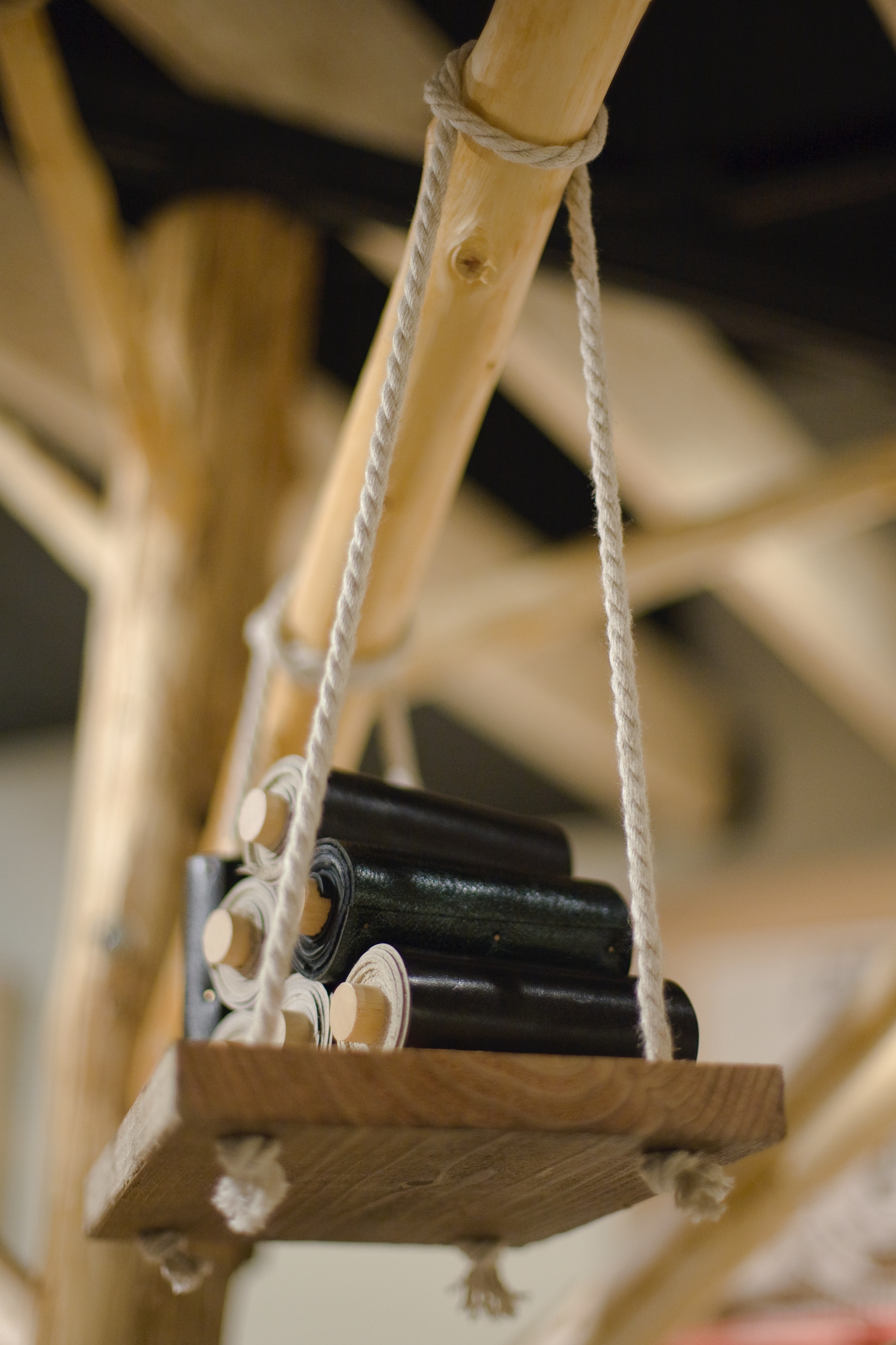
Photo © Sebastian Mayer
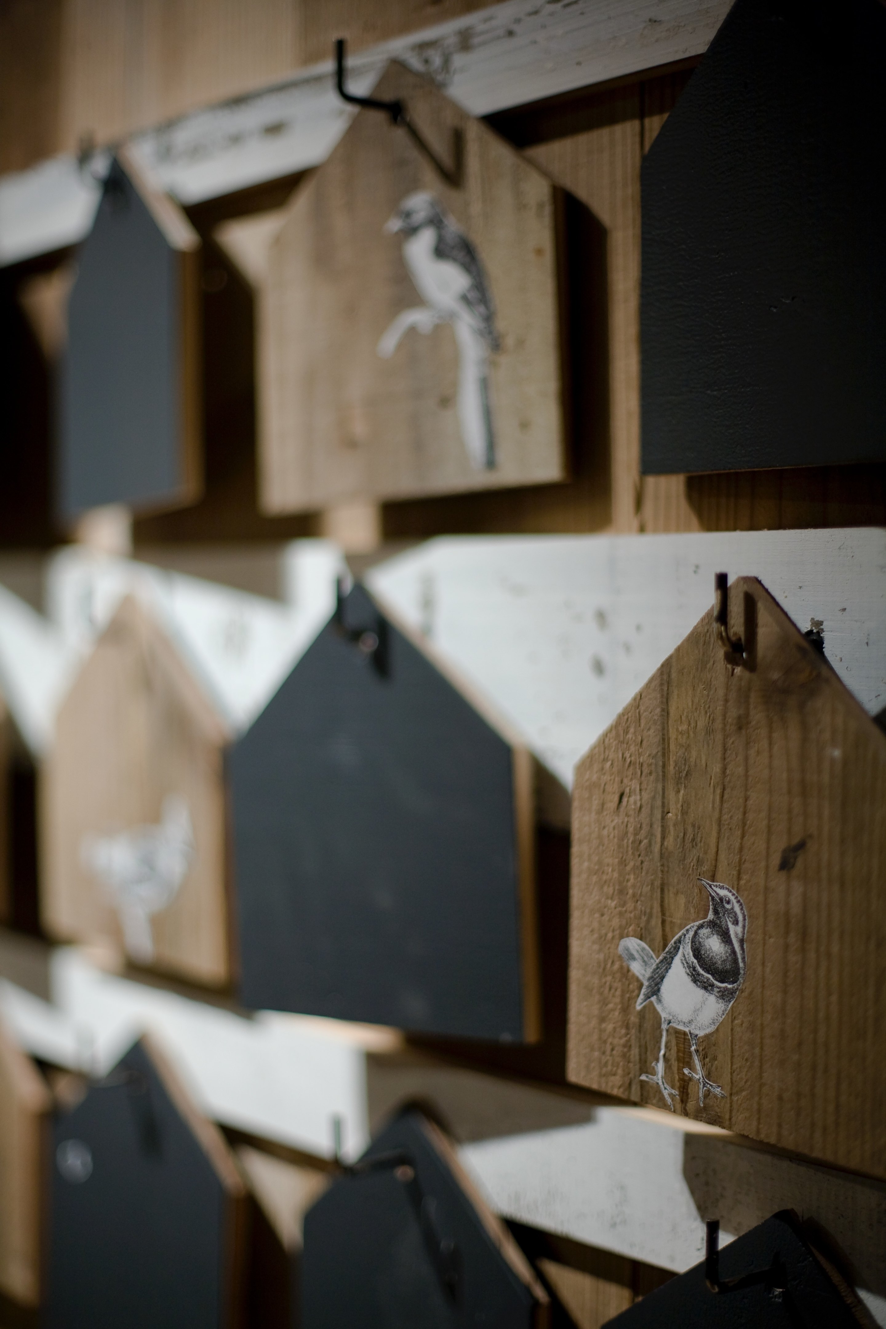
Photo © Sebastian Mayer
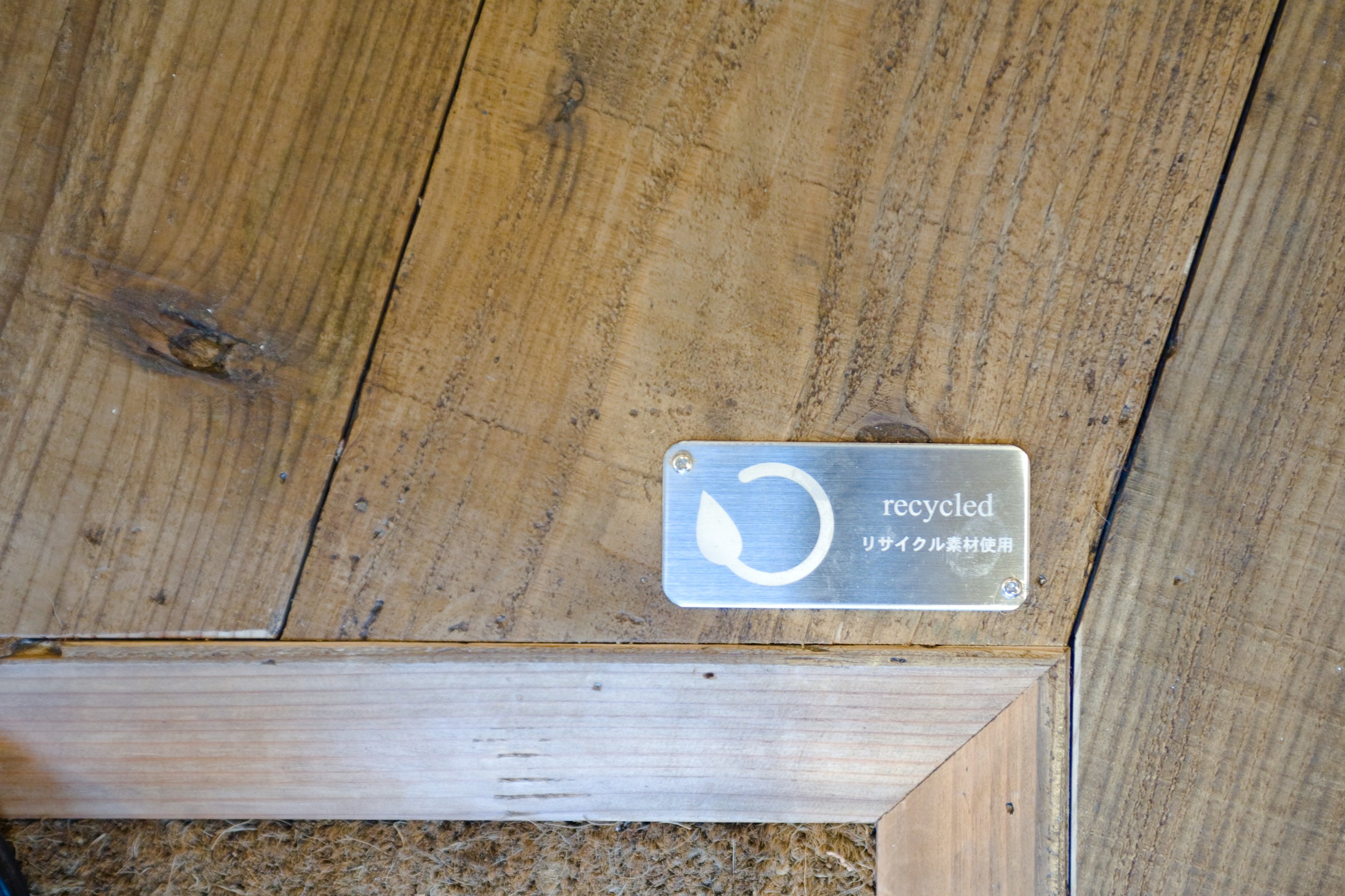
Photo © Sebastian Mayer
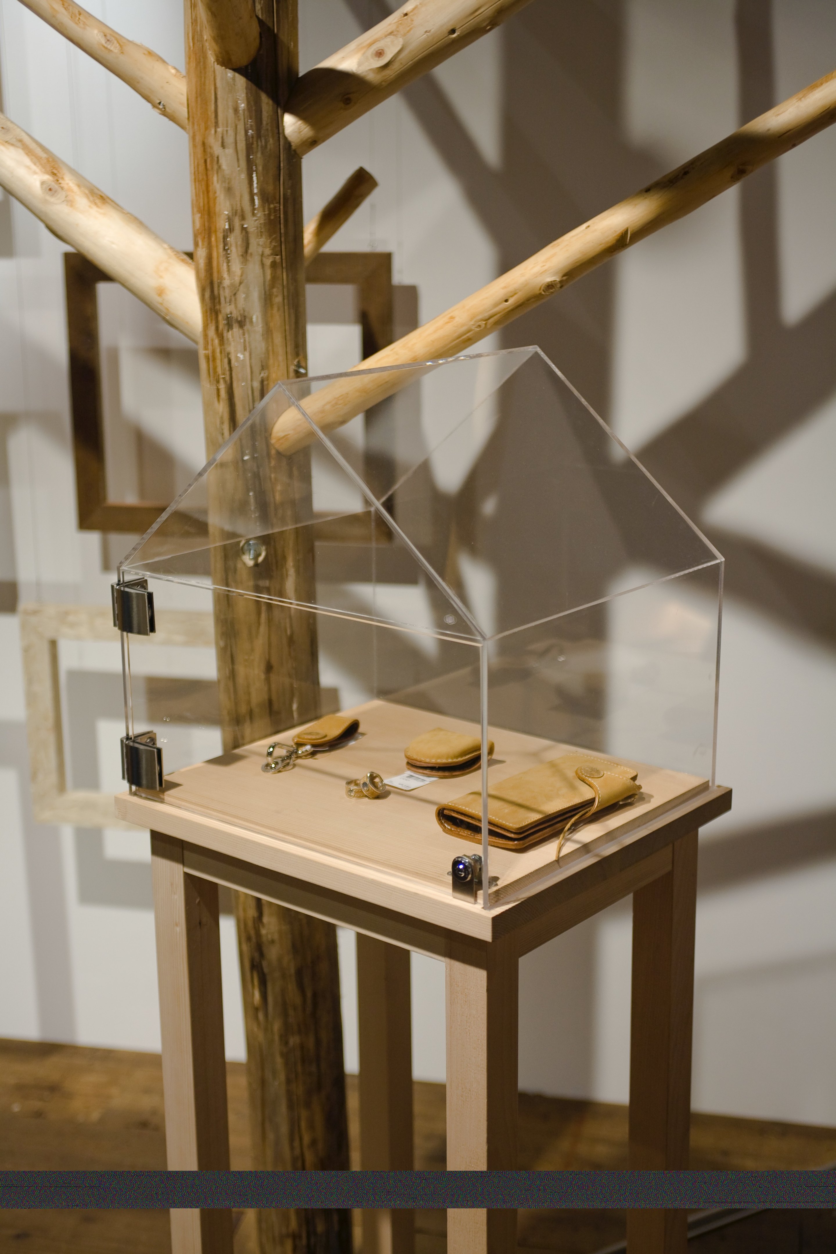
Photo © Sebastian Mayer
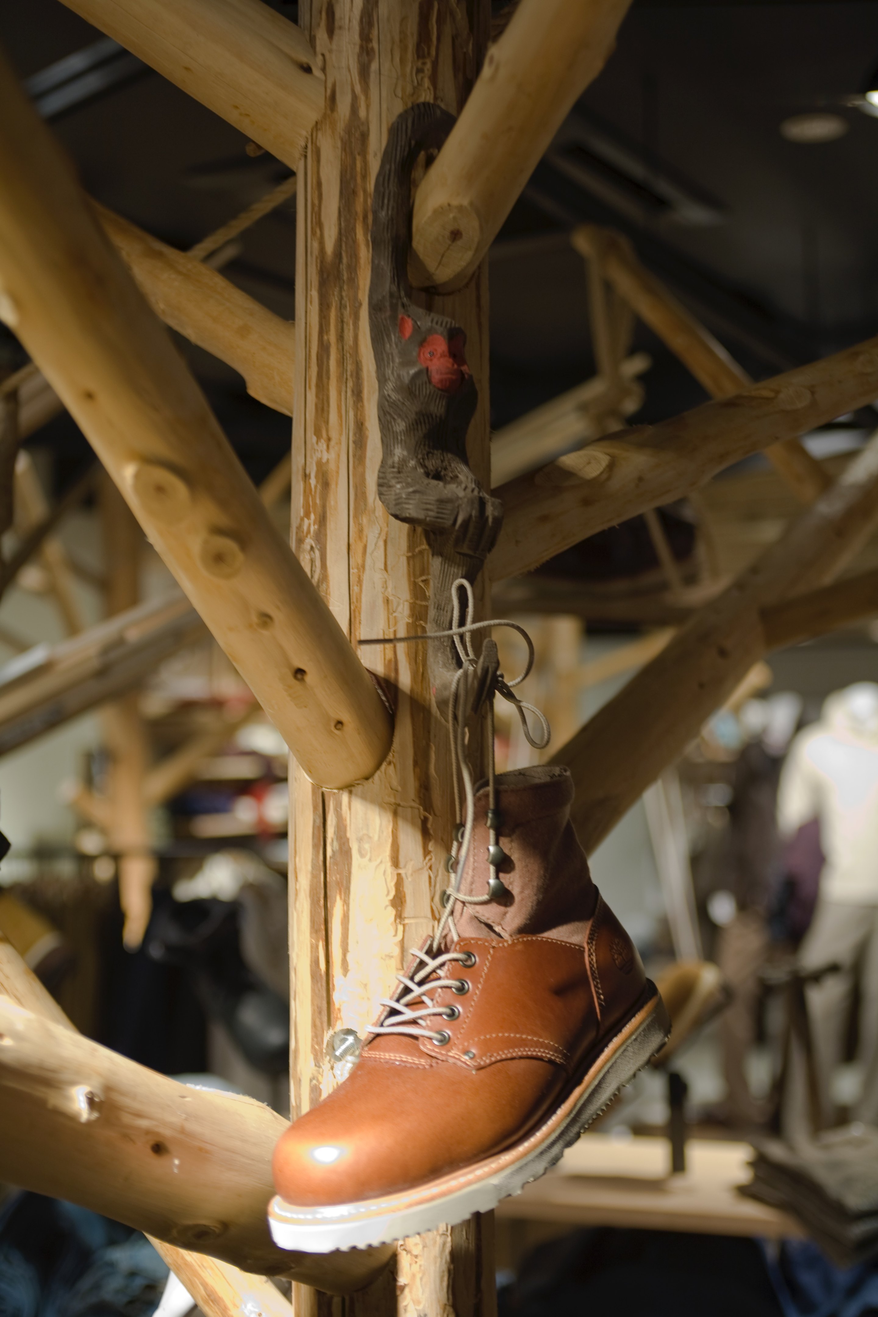
Photo © Sebastian Mayer

Photo © Sebastian Mayer
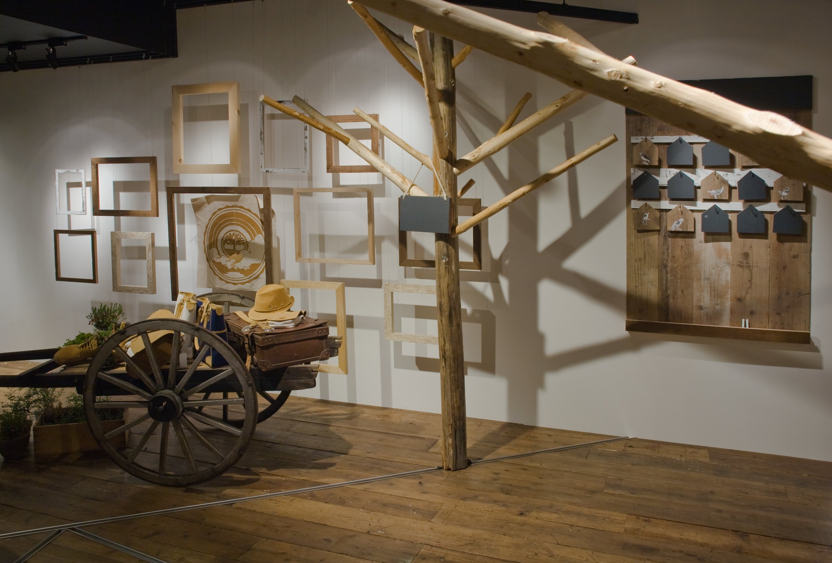
Photo © Sebastian Mayer
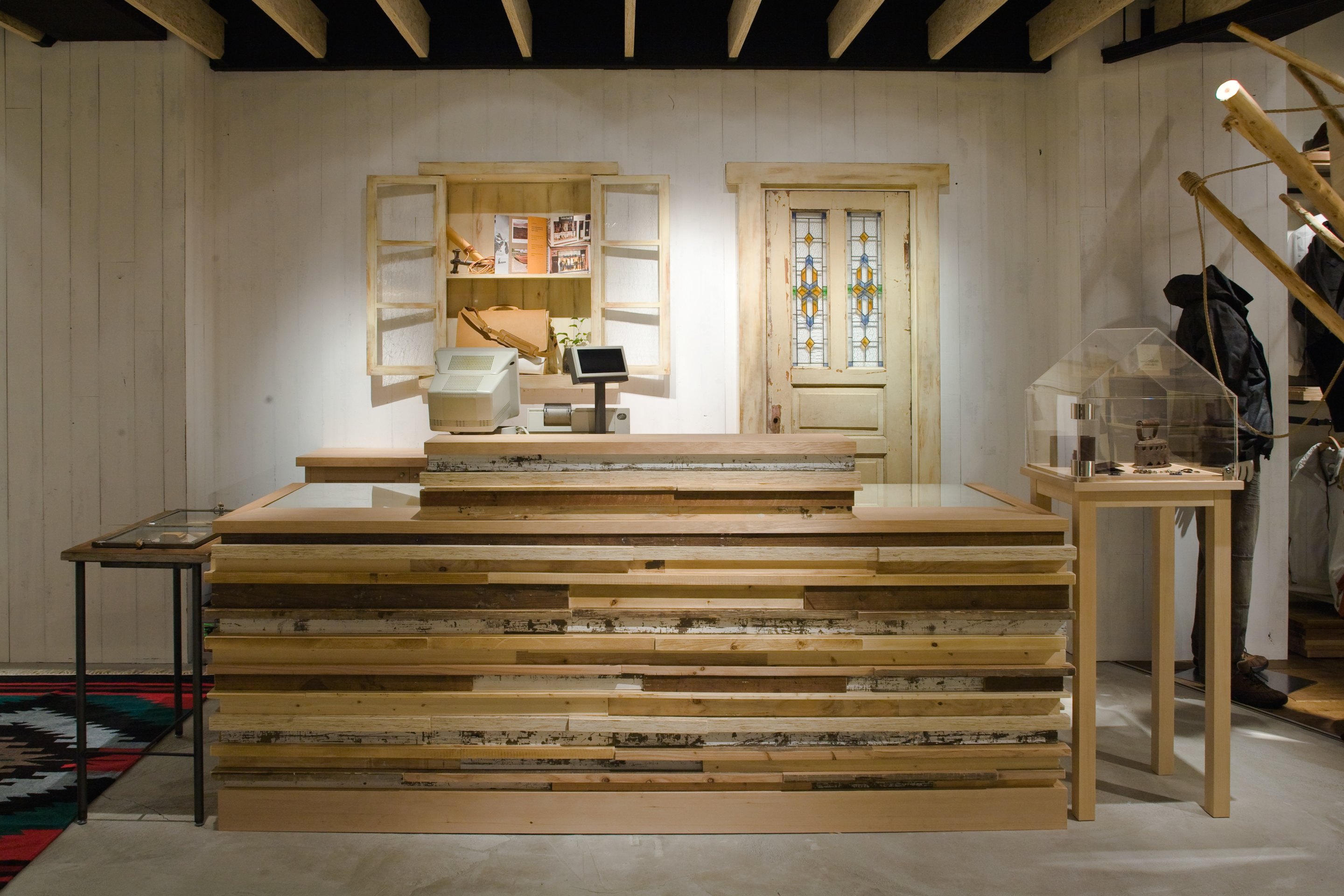
Photo © Sebastian Mayer
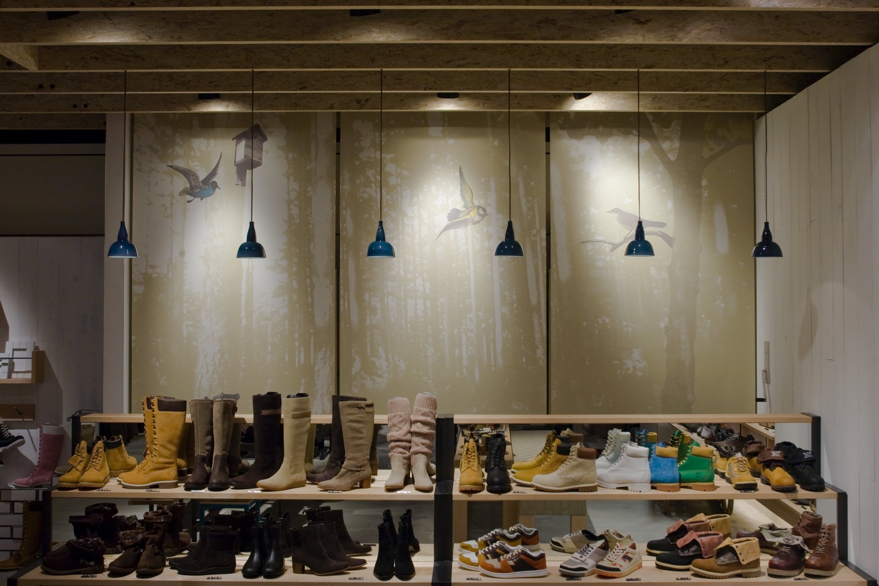
Photo © Sebastian Mayer
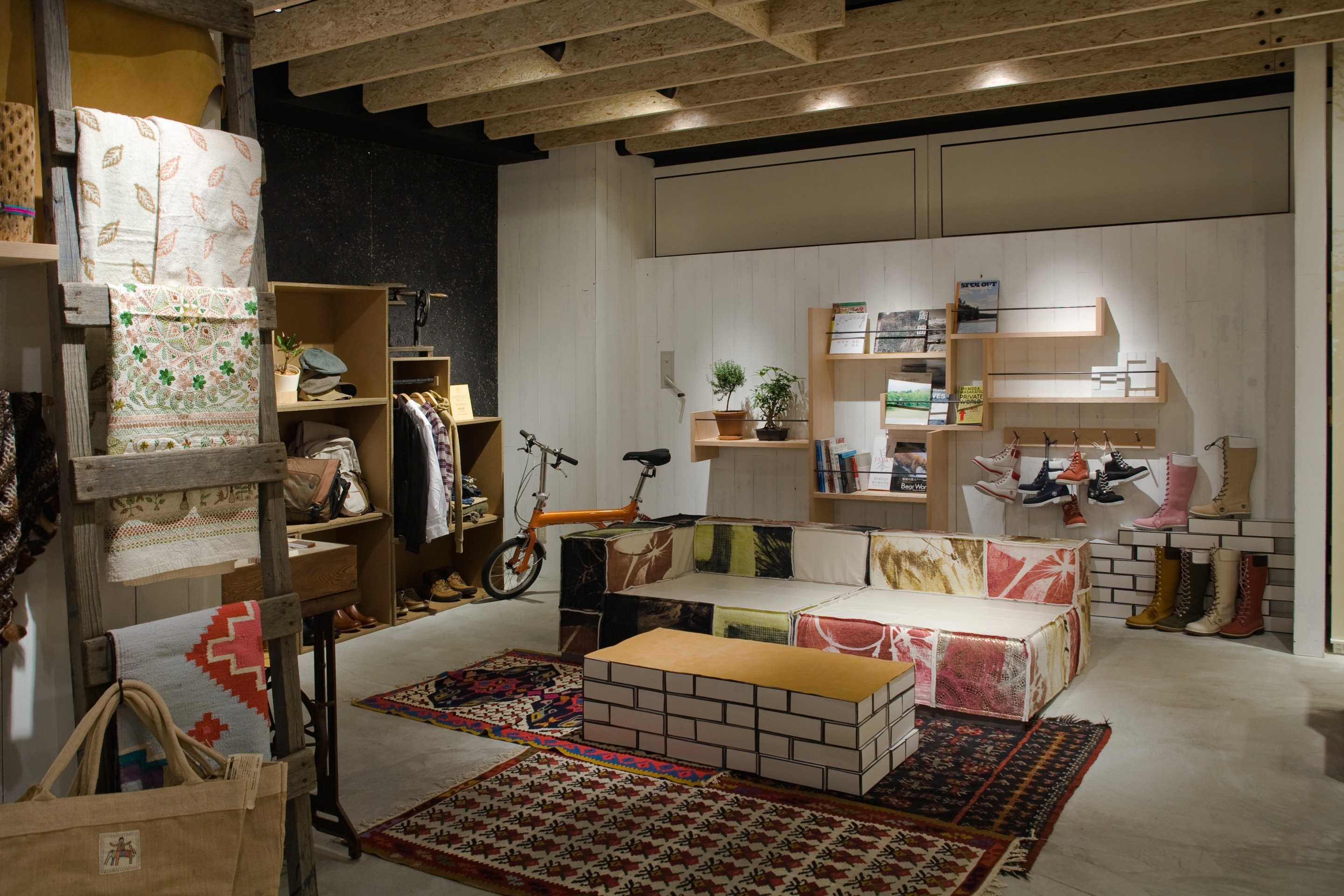
Photo © Sebastian Mayer
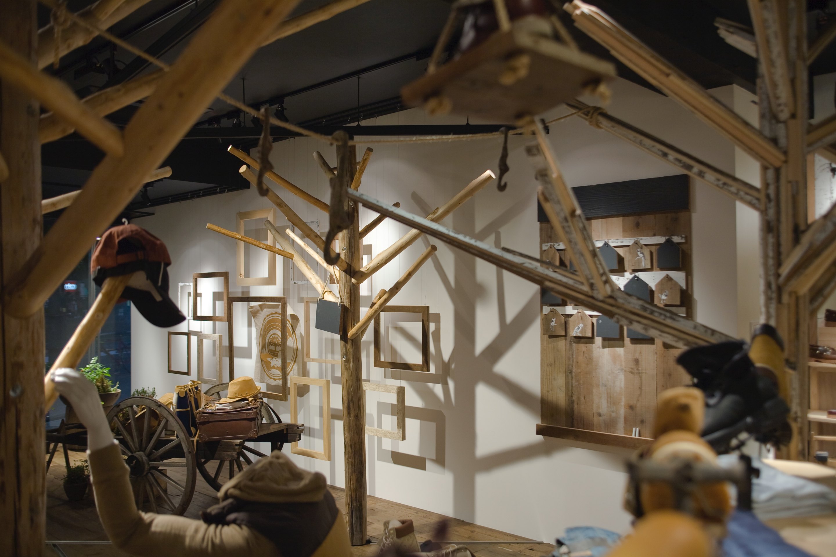
Photo © Sebastian Mayer
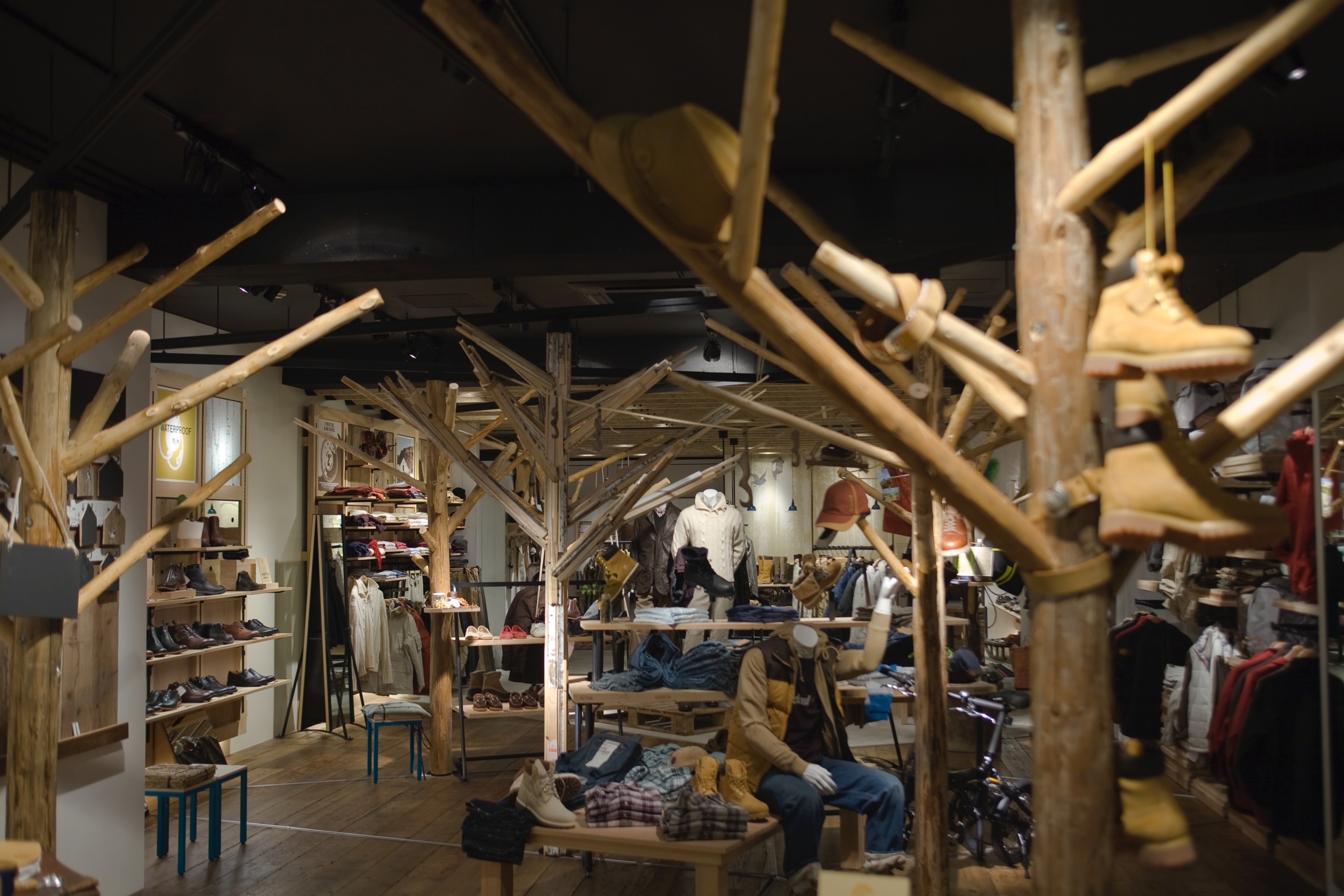
Photo © Sebastian Mayer
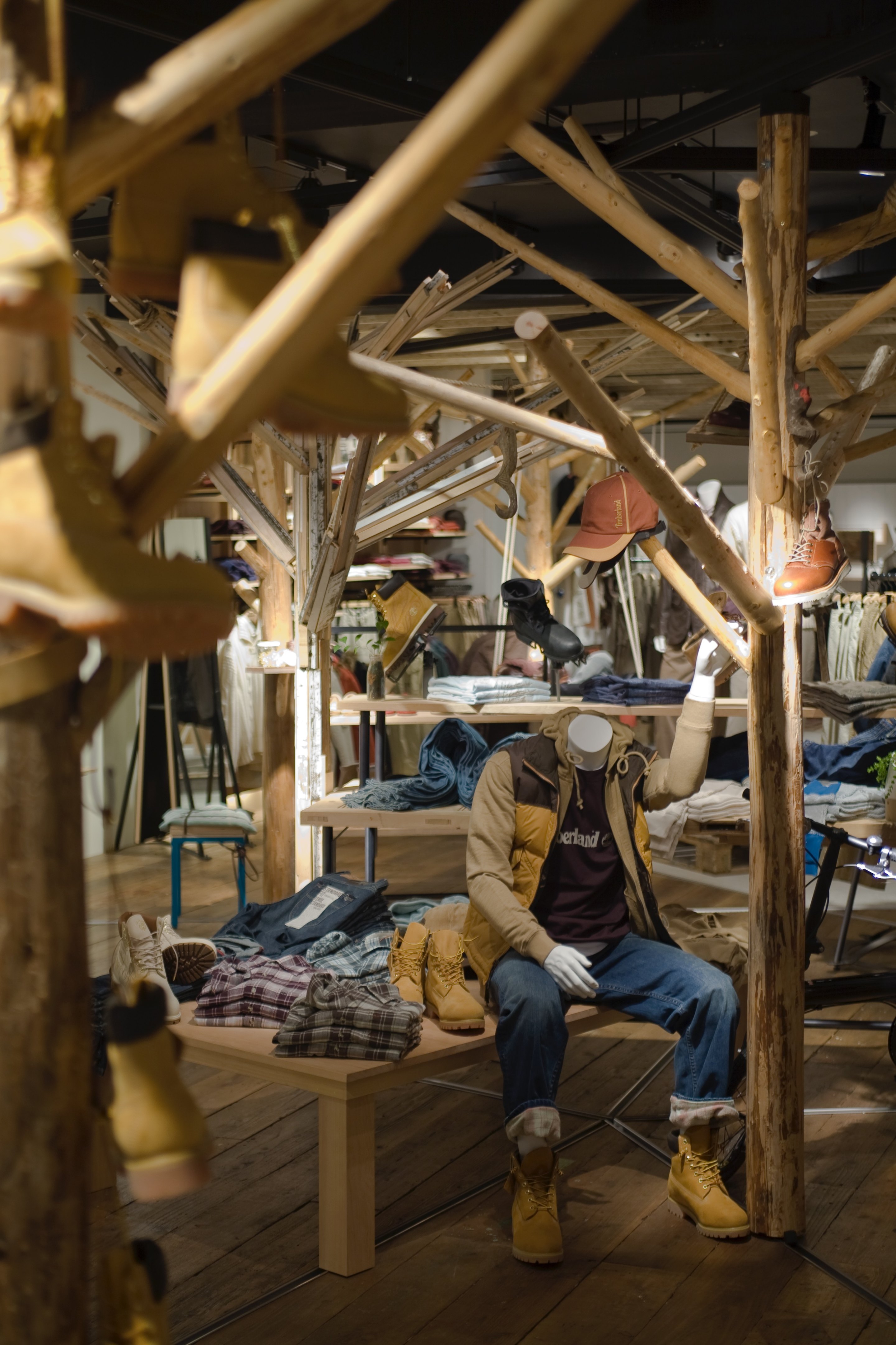
Photo © Sebastian Mayer
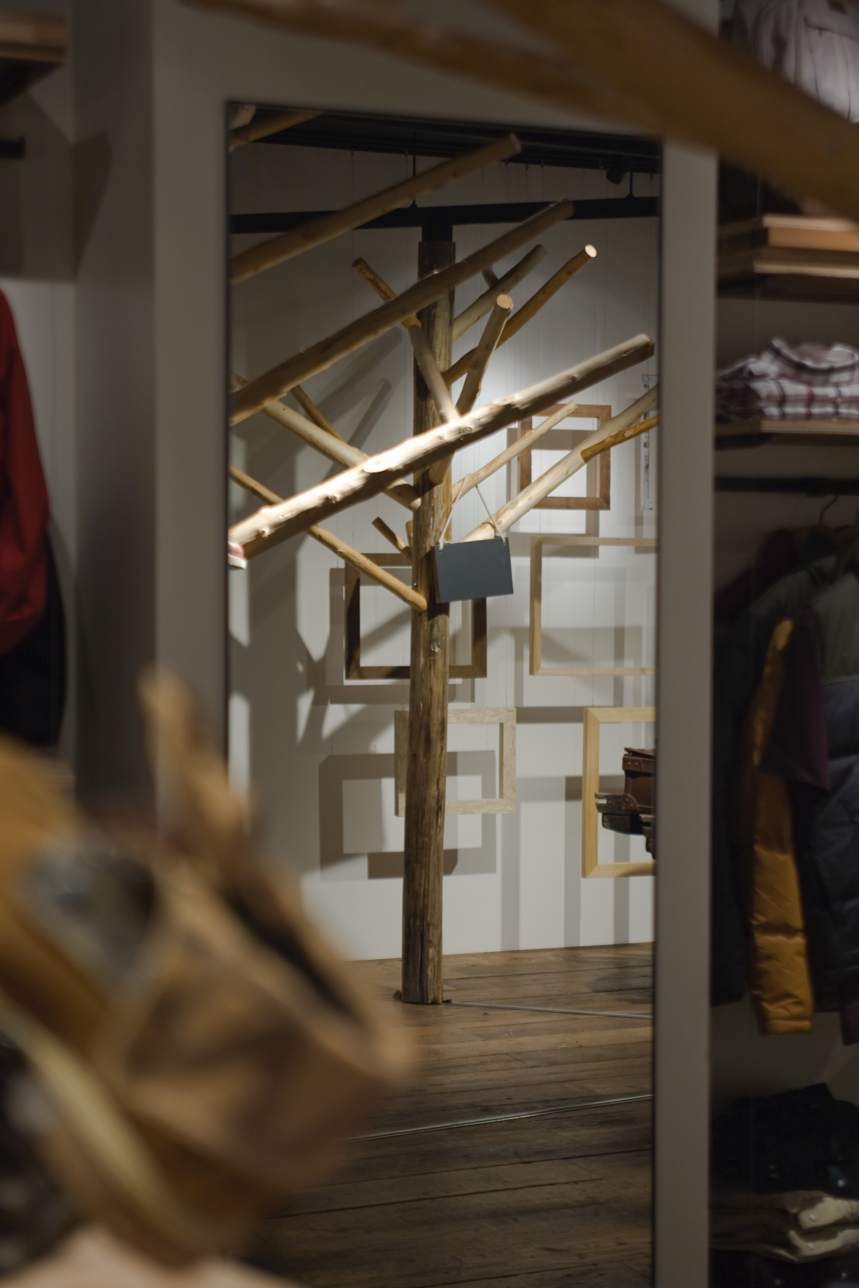
Photo © Sebastian Mayer
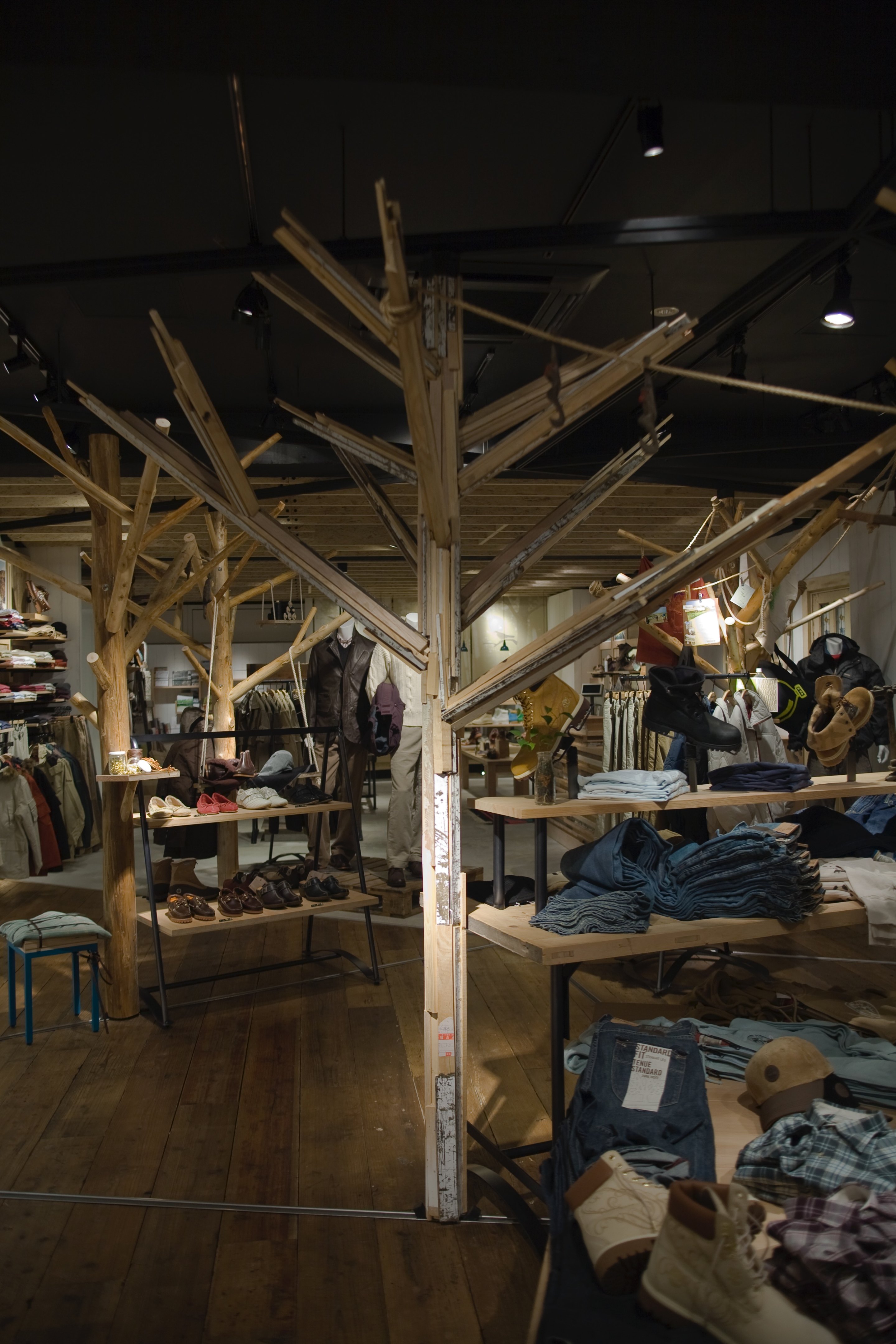
Photo © Sebastian Mayer