Data
- Location
- National Museum of Emerging Science and Innovation - MIRAIKAN, Tokyo, Japan
- Team
- Megumi Matsubara, Hiroi Ariyama
- Completion year
- 2009
- Exhibition title
- IT'S A TASTY WORLD - FOOD SCIENCE, NOW!
- Exhibition period
- 29 Nov,2009 – 22 Mar , 2010
- Client
- National Museum of Emerging Science and Innovation (Miraikan)
- Curator
- Asako Ogita, Yumi Miyahara
- Purpose
- Exhibition design
- Floor area
- 700 sqm
- Collaborators
- Tetsuya Yamamoto (POTTO)
Edwina Hörl, Yuko Wakana
NOMURA Co., Ltd. - Photographers
- Kenshu Shintsubo, ASSISTANT
- Urls
- Edible Geography Interview - Tasty World Tour
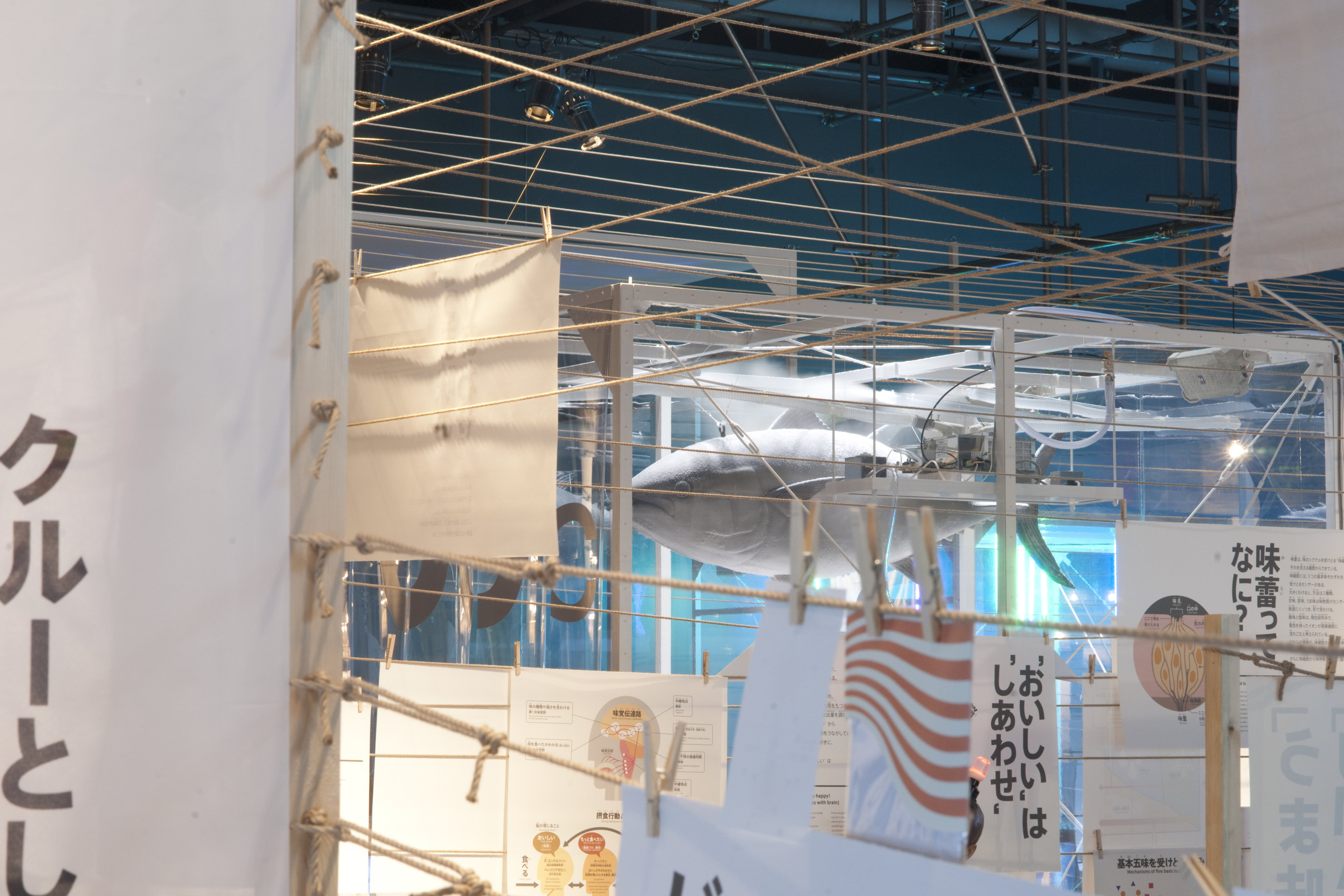
The theme of the exhibition space is “relationship”. We thought nothing should stand between each person and food, or food and food. Therefore, we didn’t build any walls.
We created the basic planning of the space by 4.5m Japanese cedar logs and 6mm thin hemp ropes. This is based on our understanding or trust on people’s perception of food culture.
Especially Japanese people’s food culture is very sophisticated. By nature, the Japanese have the feeling of respect towards nature that make us treasure any kind of food regardless of whether coming from sea or from mountains. Even if not stated in obvious manner, this feeling of respect underlies the Japanese spirit. This understanding convinced us to go the simplest way of visualizing the basic of the exhibition space; using only cedar logs and rope. Even though physically walls are absent, we thought such simple use of symbolic natural materials could operate the same function as walls, as we expected certain “Japaneseness (respect for nature)” from visitors. For example, when you visit temples or shrines in this country, a simple piece of paper or just small stone arrangement can prevent you from touching or stepping in something sacred. There we could see designed relationship by a smallest action to nature.
In this 700sqm exhibition, everything is made as multi-layered installation. Each of them required human intervention in the process of making. They required not money but time. In this exhibition design and art-direction, we tried to design “how time is spent”. The scope of design reached every scale, starting from 4.5m cedar logs, knotting technique, a dress designed from a tongue, to a single stitch of embroidery.
When you enter the exhibition space, you might lose the sense of your size. It is some kind of a floating feeling that we know from a story like Alice in Wonderland. One step forward, you feel you are bigger, while one more step would make you feel smaller. You can enjoy the process of restructuring the relationship between food and yourself.
Here we explored installation as a language. Everything you have to learn is translated into experience. This makes it possible to merge seemingly conflicting territories; scale difference, generation difference, difference of fields such as culture, science and education. We hope this new spatial language helps people to feel free from any kinds of preoccupation. We are very optimistic about art merged into everyday world.
From museum’s press release:
The exhibition space put together with Japanese cedar logs and hemp string forms a simple, natural and close impression. Exhibits located distantly and moving audiences will float as they are folded together through the wall and the entire space will compose a single exhibit scene. The scenes will change by the minute and new scenery will be created as you move ahead. The experience will remind you of traditional houses and the architecture of temples in Japan.
Images
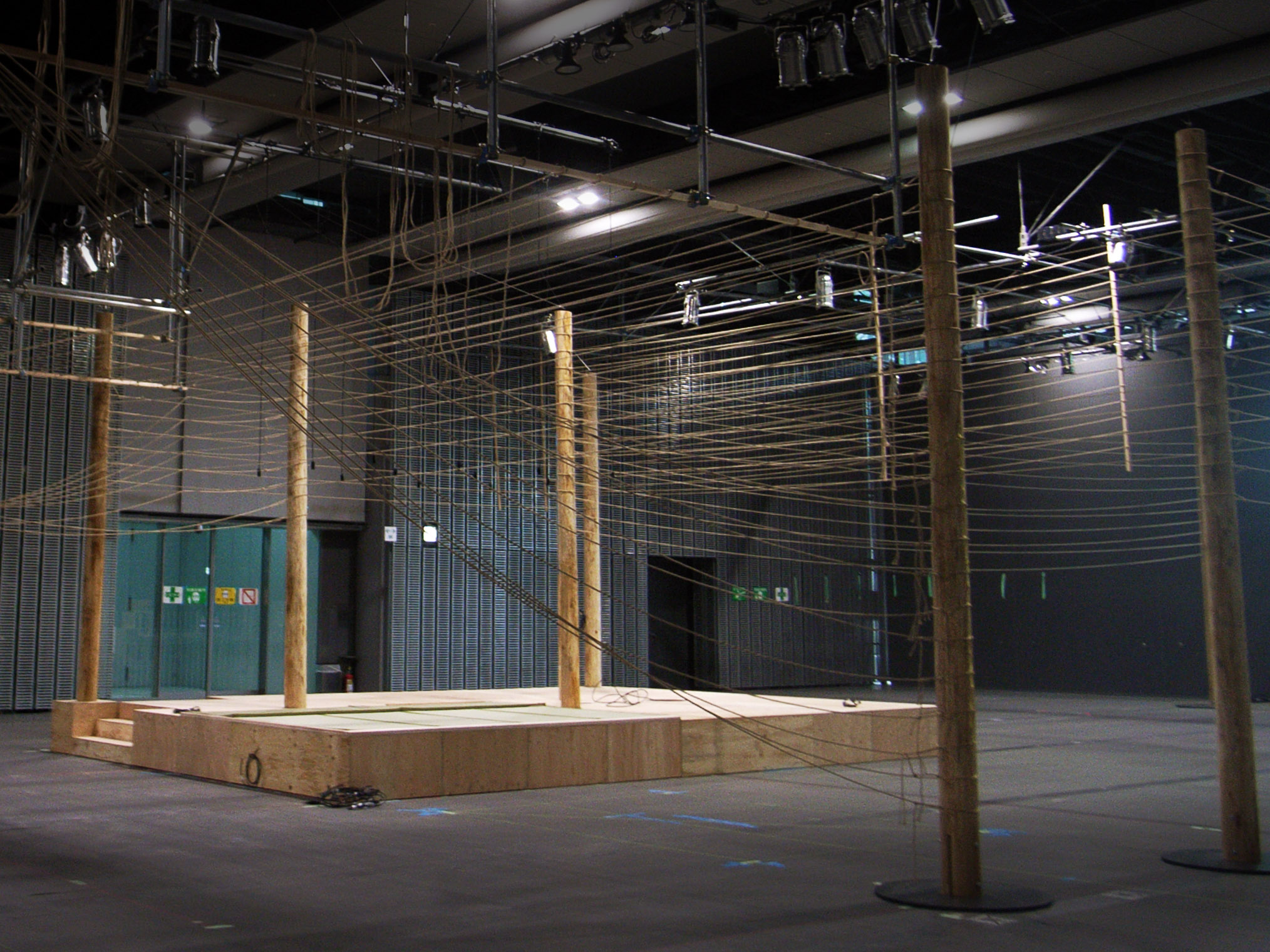
Construction image
Photo © ASSISTANT
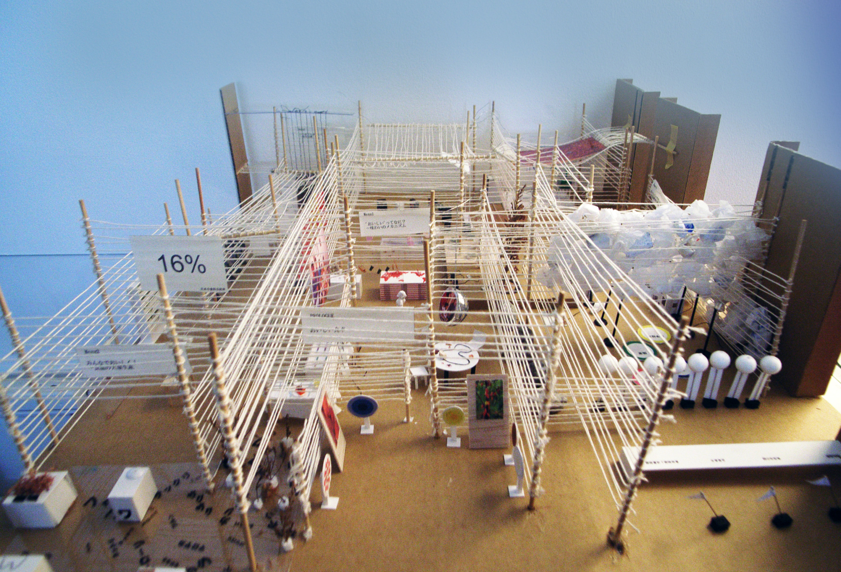
Model image
Photo © ASSISTANT
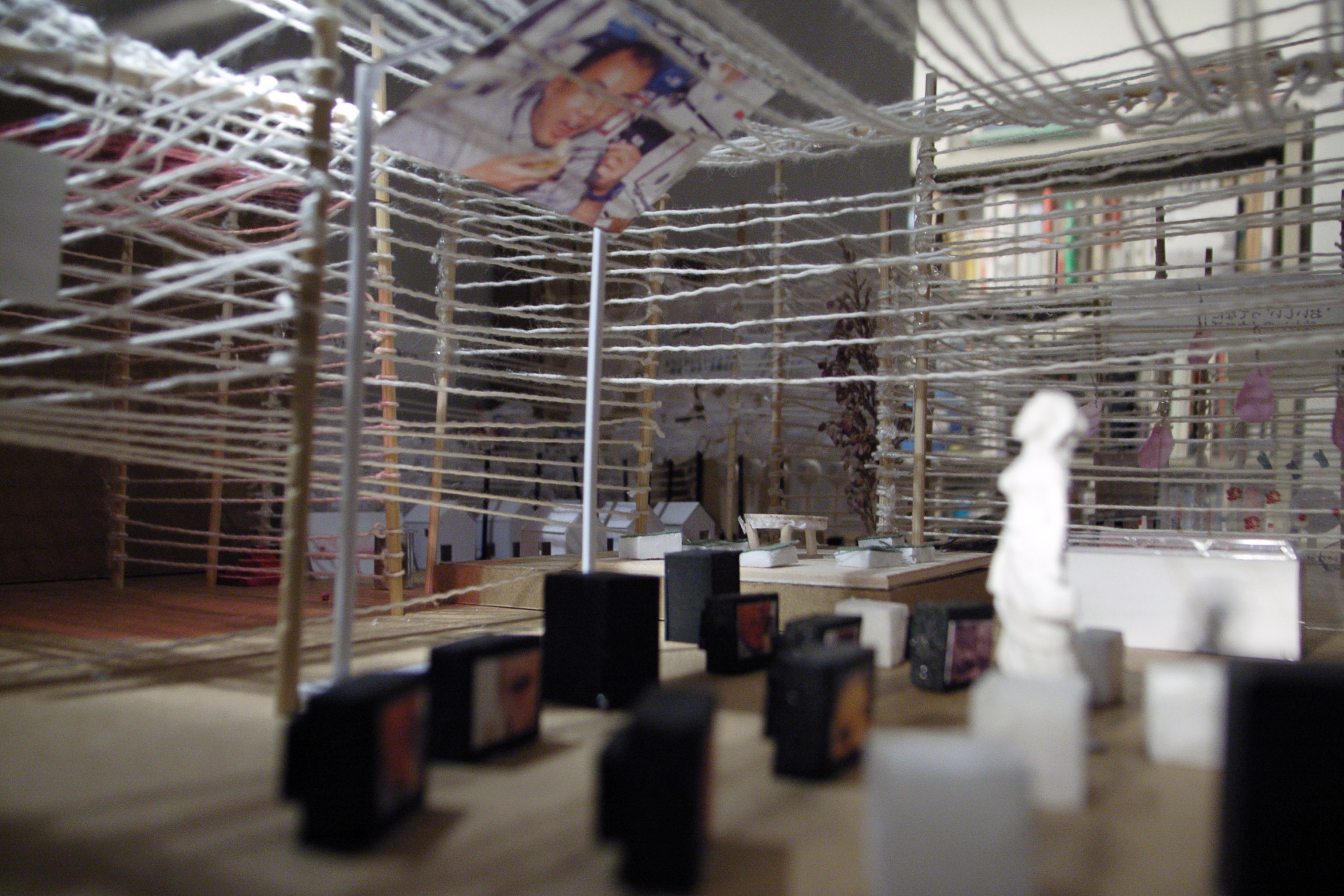
Model image
Photo © ASSISTANT
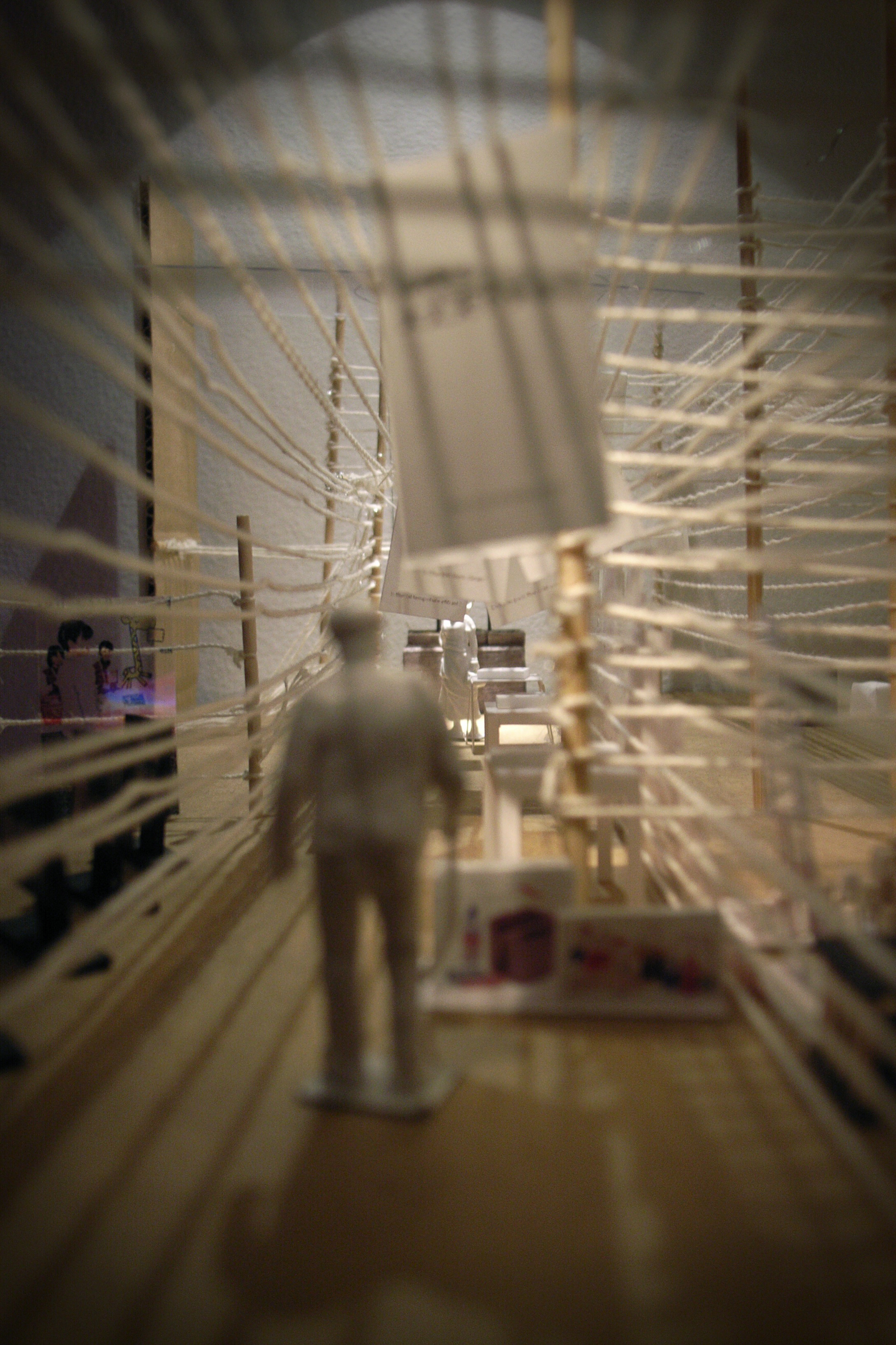
Model image
Photo © ASSISTANT
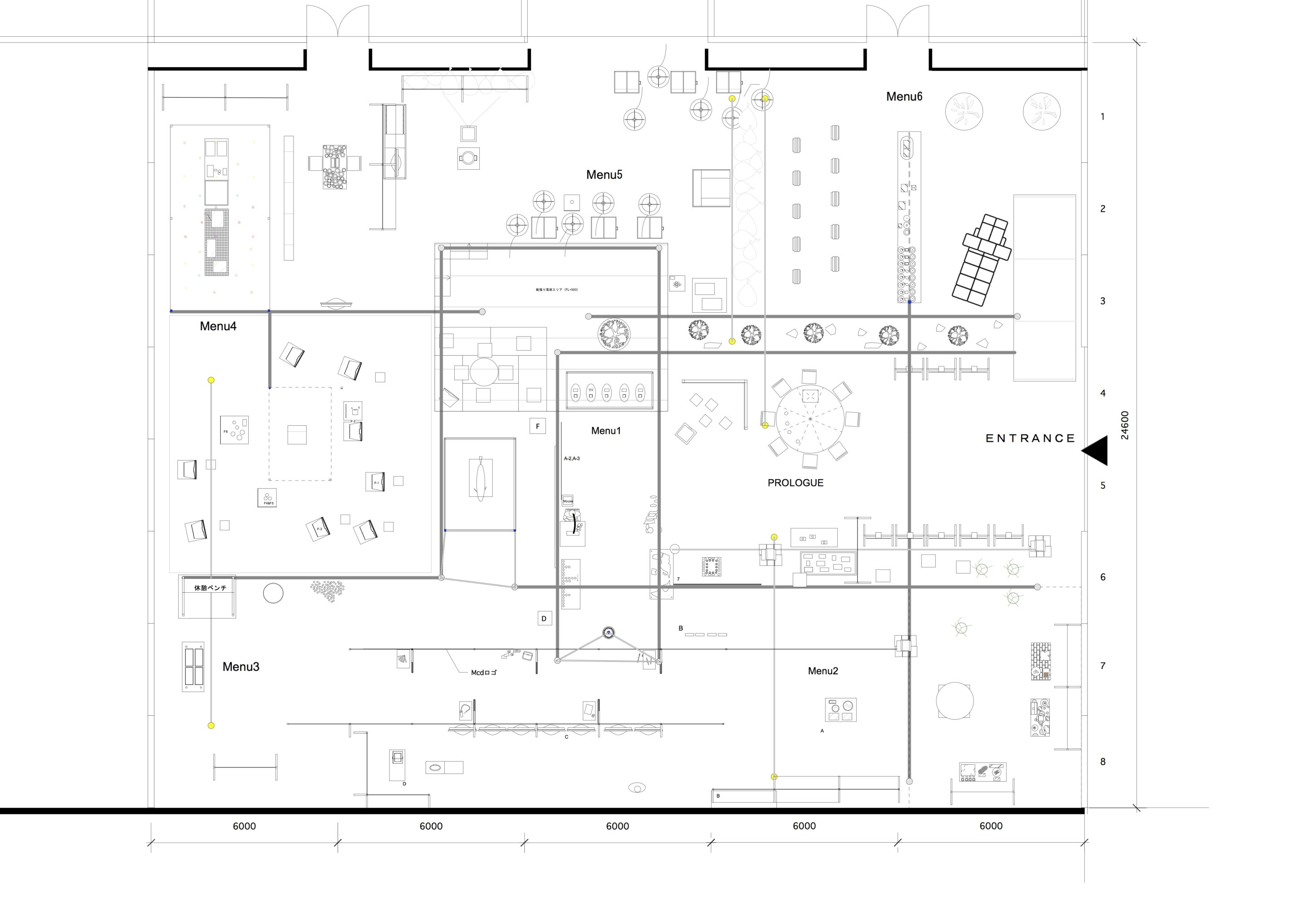
Architecture drawing, floor plan
Photo © ASSISTANT
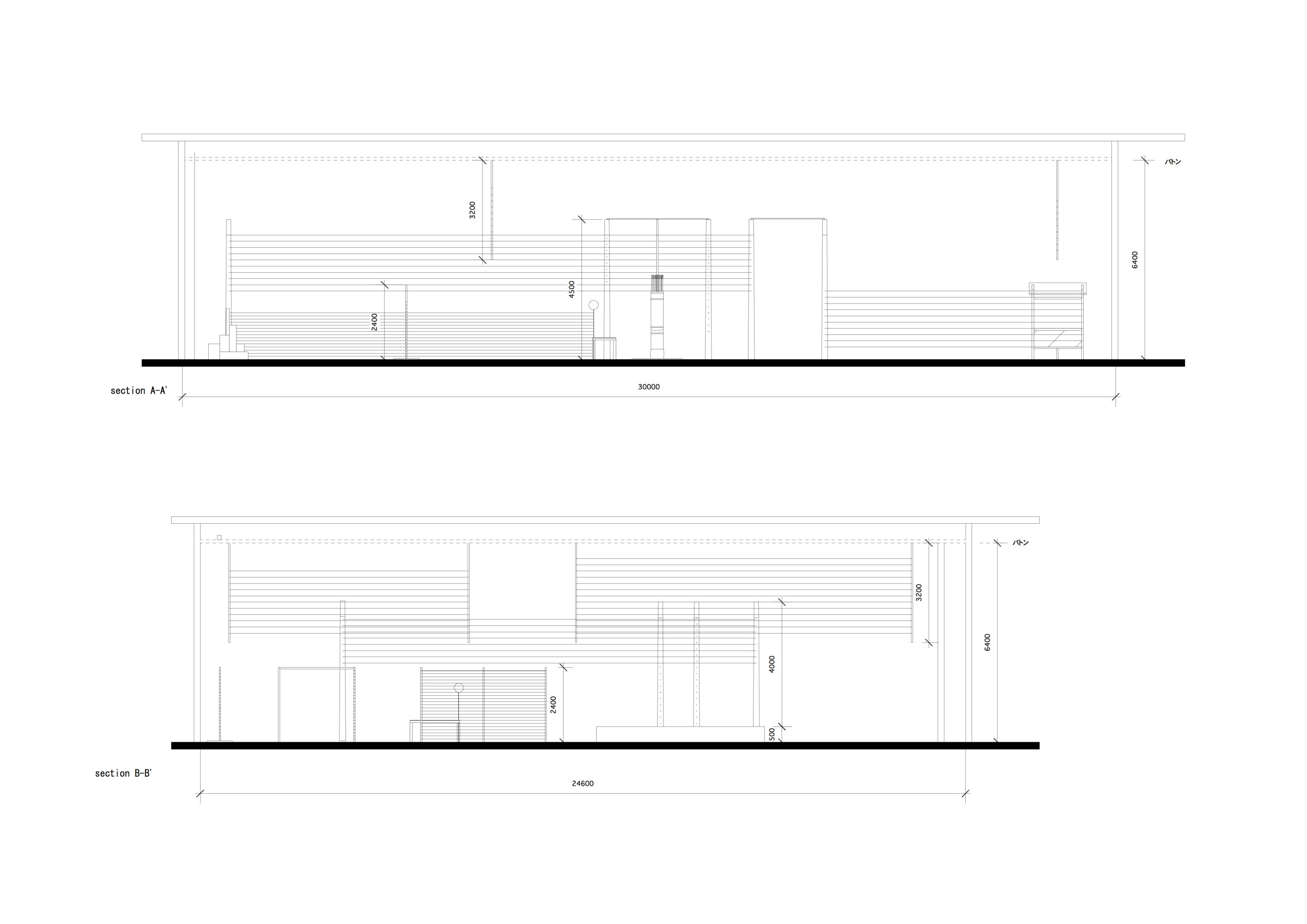
Architecture drawing, cross section
Photo © ASSISTANT
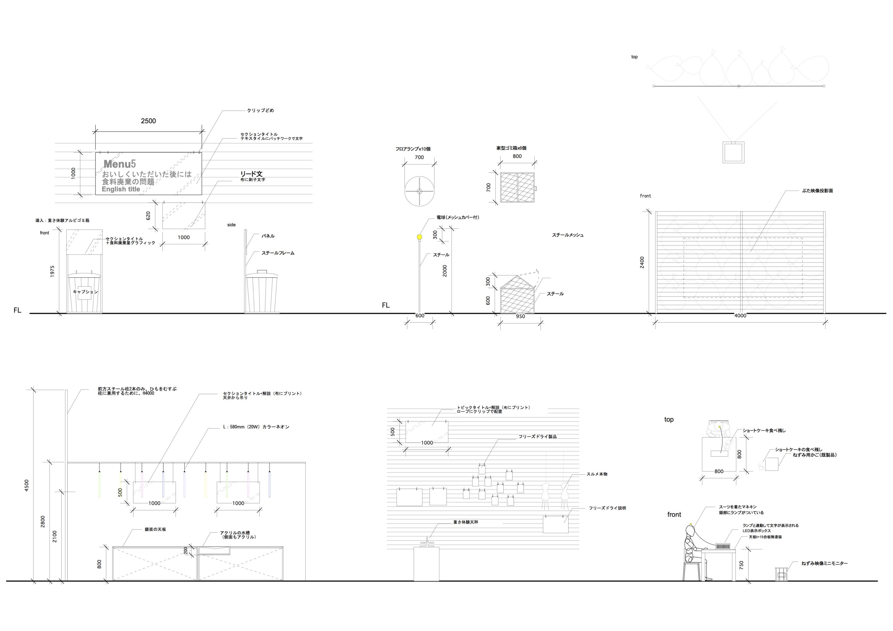
Architecture drawing, detail of installation
Photo © ASSISTANT
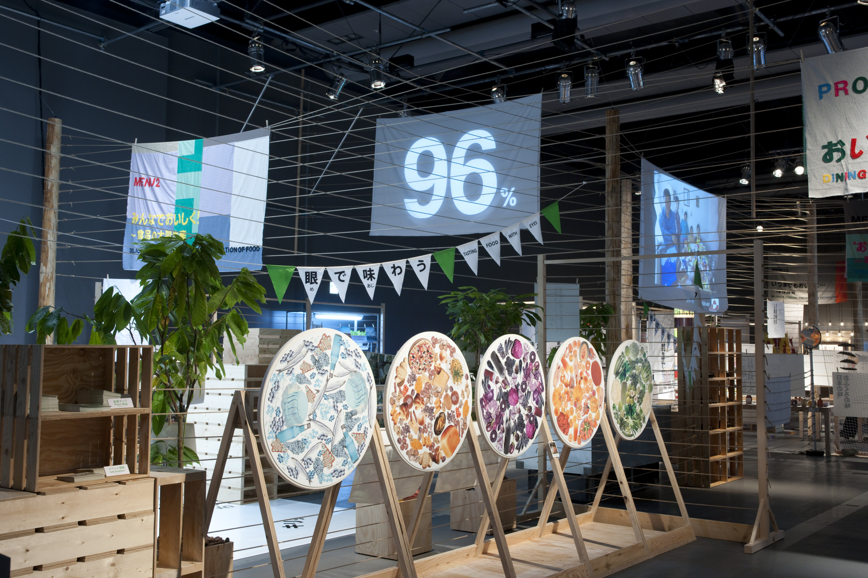
Photo © Kenshu Shintsubo
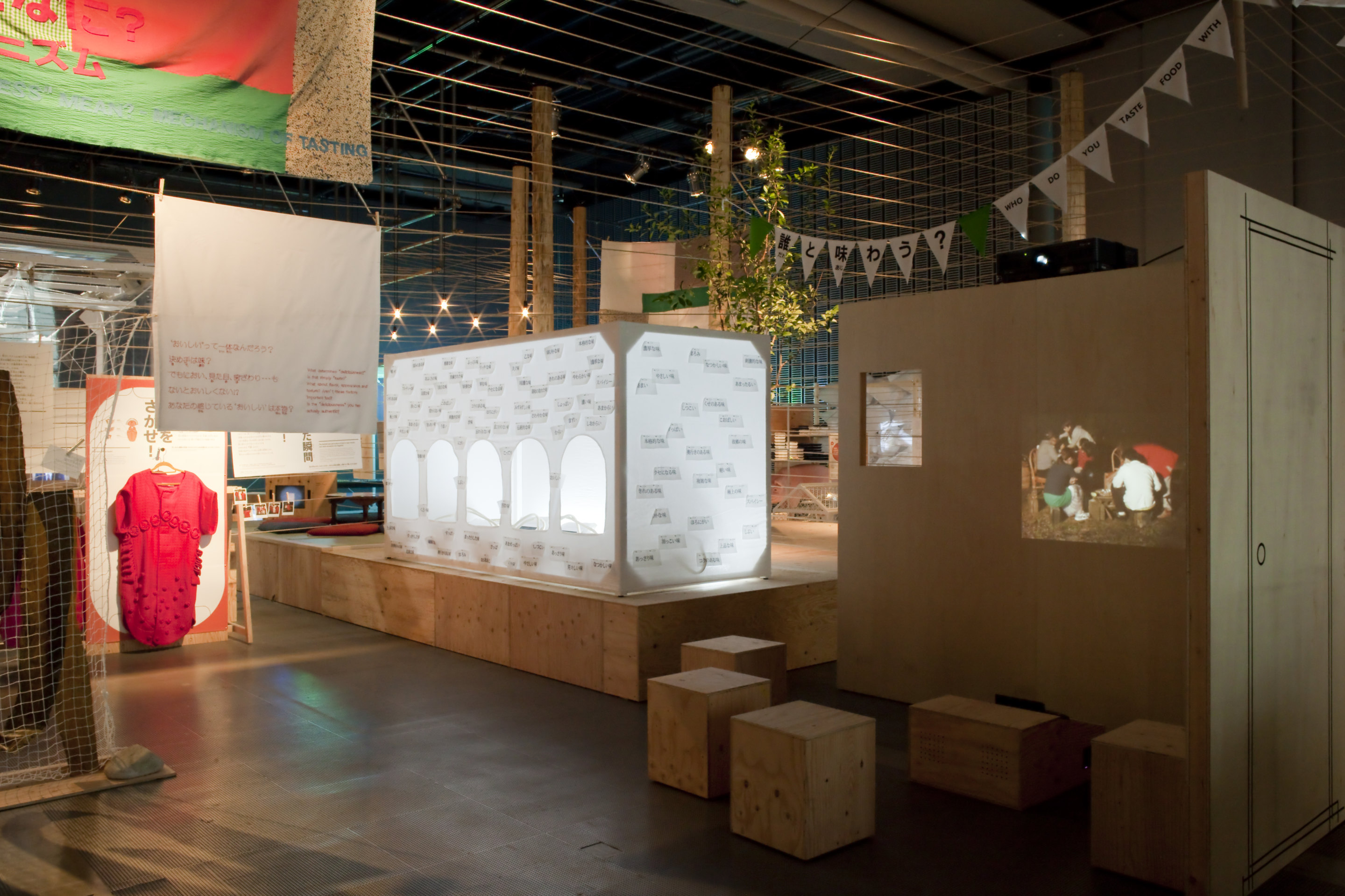
Photo © Kenshu Shintsubo
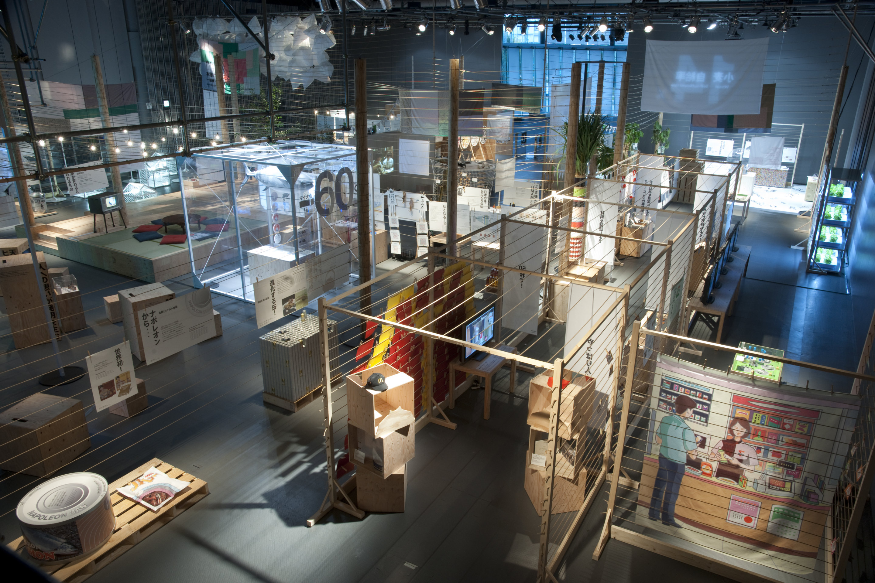
Photo © Kenshu Shintsubo
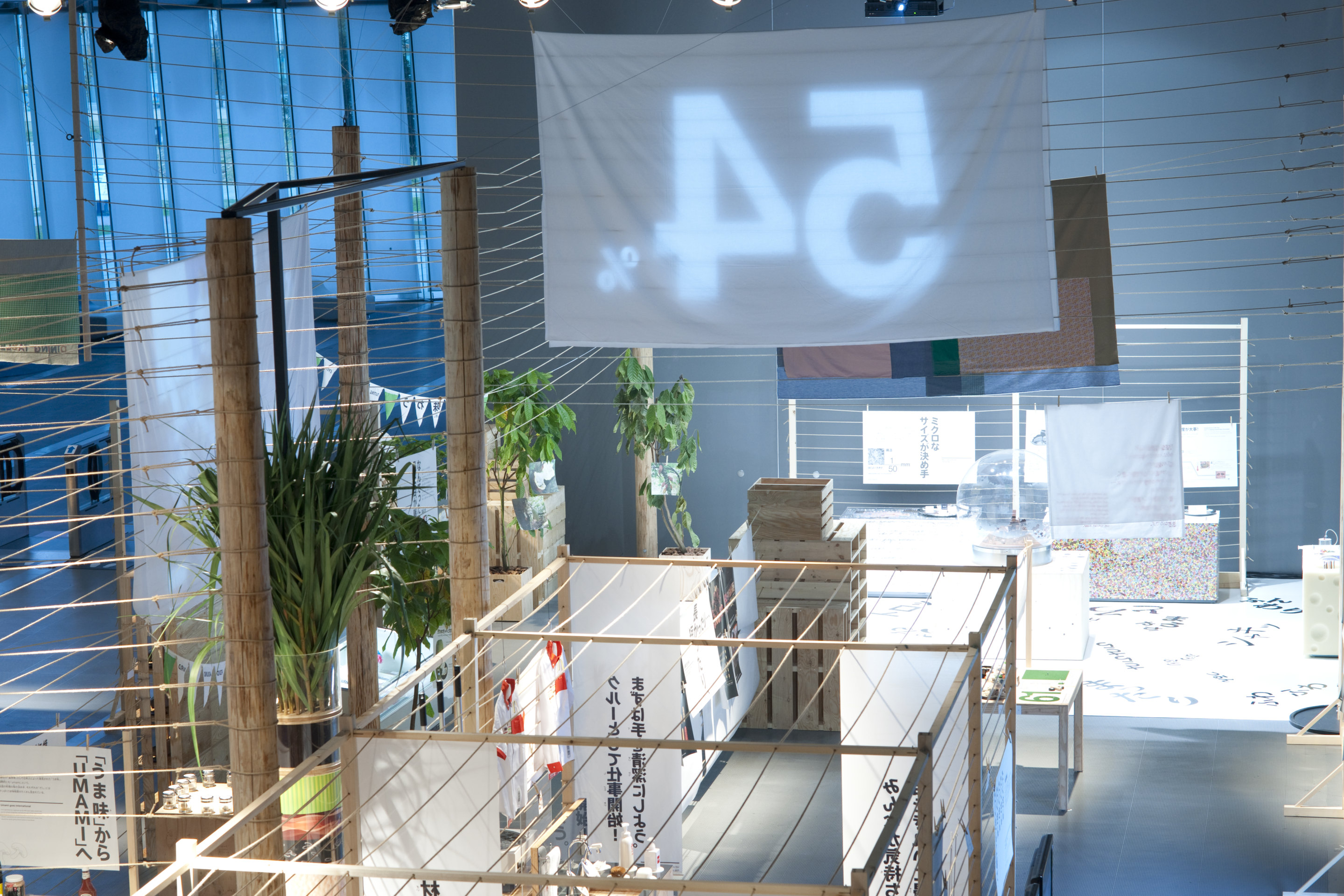
Photo © Kenshu Shintsubo
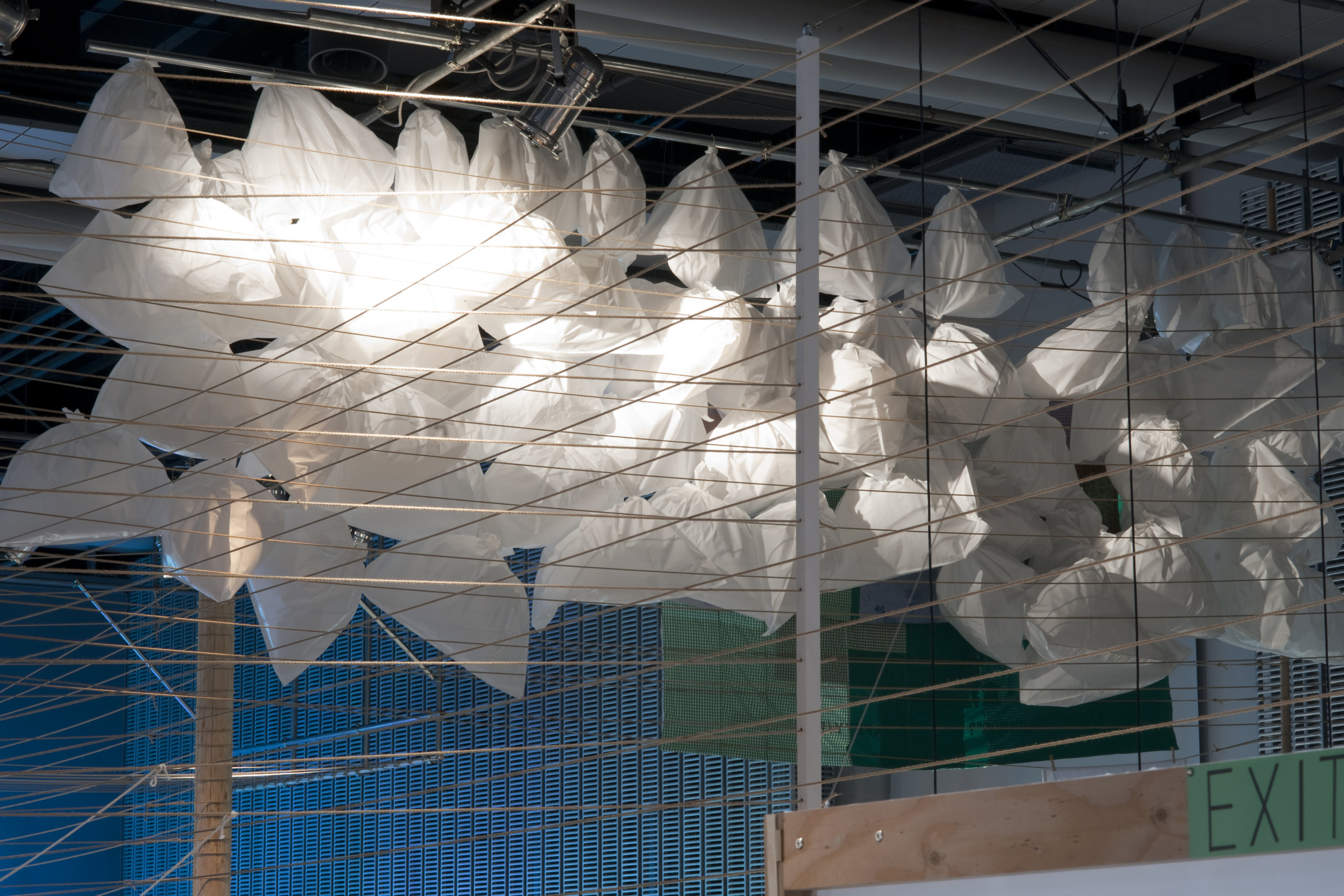
Photo © Kenshu Shintsubo
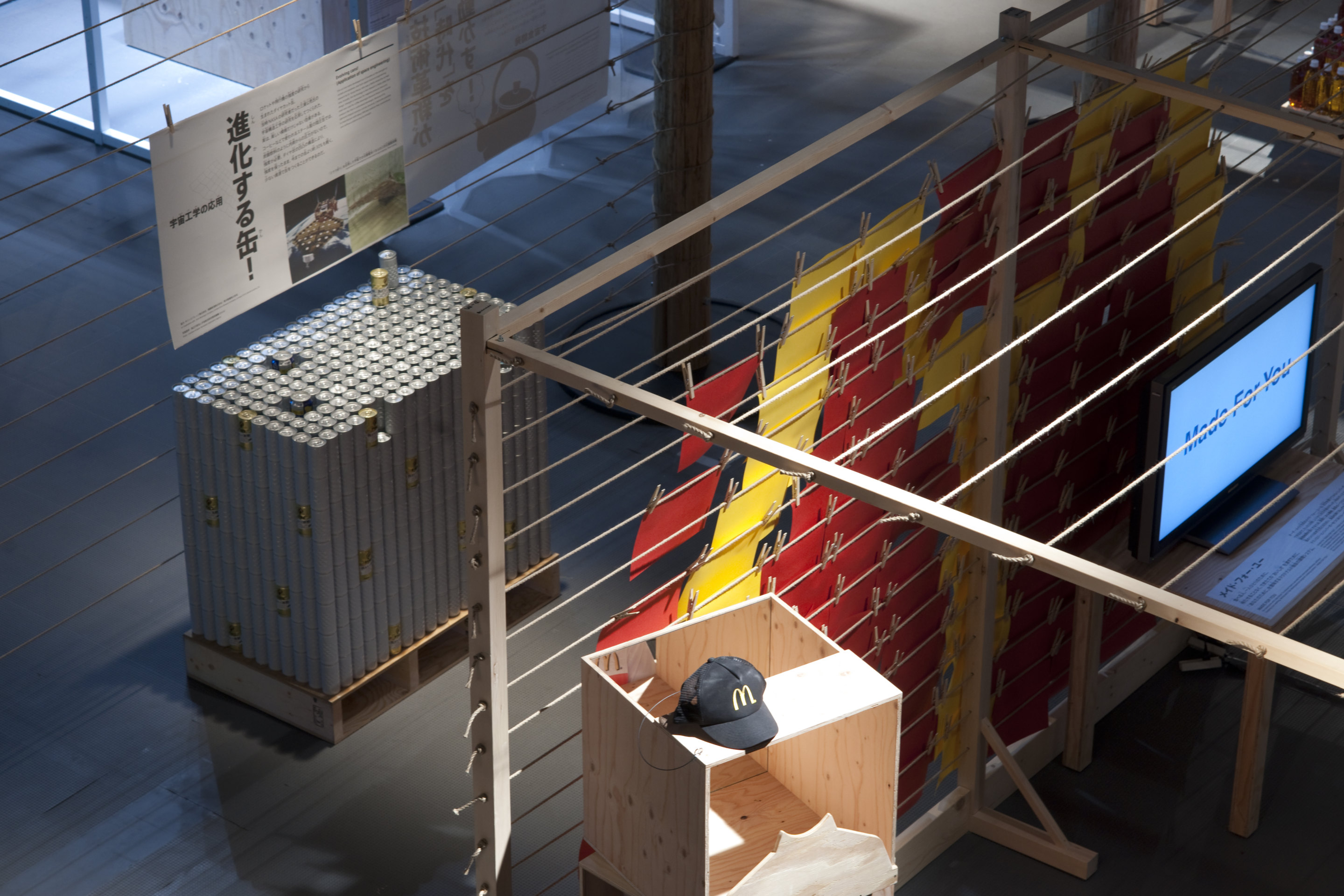
Photo © Kenshu Shintsubo

Photo © Kenshu Shintsubo
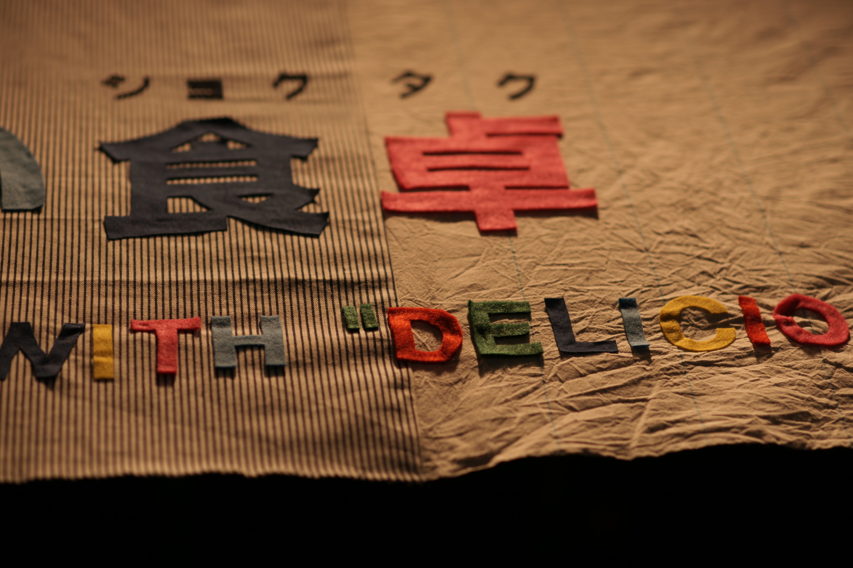
Edwina Hörl designed sginage
Photo © Kenshu Shintsubo
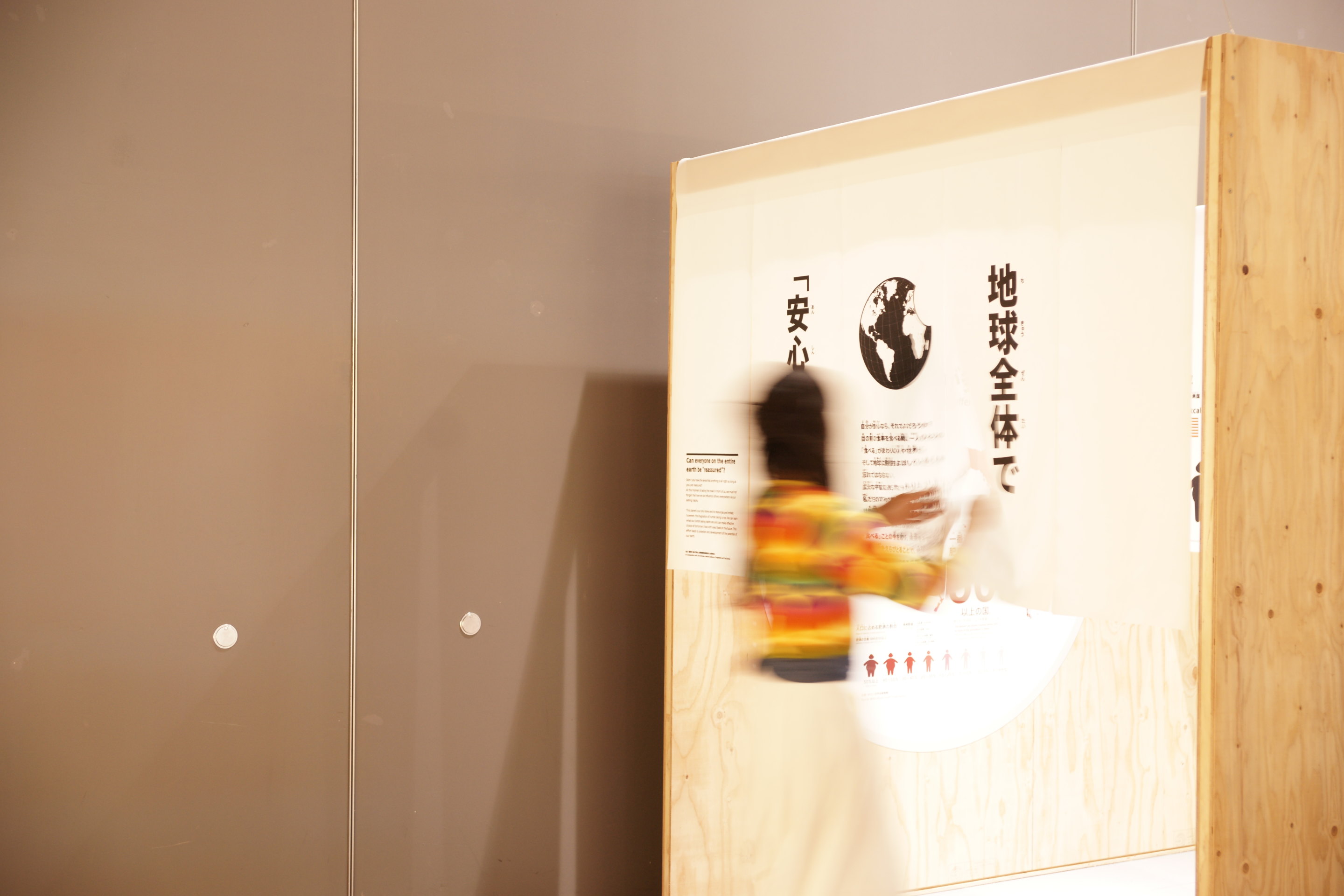
Photo © Kenshu Shintsubo
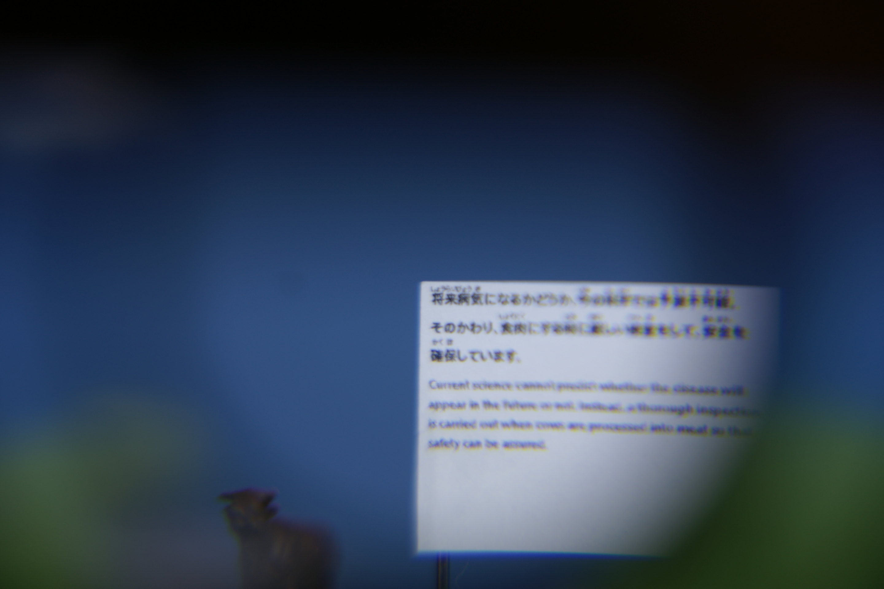
Photo © Kenshu Shintsubo
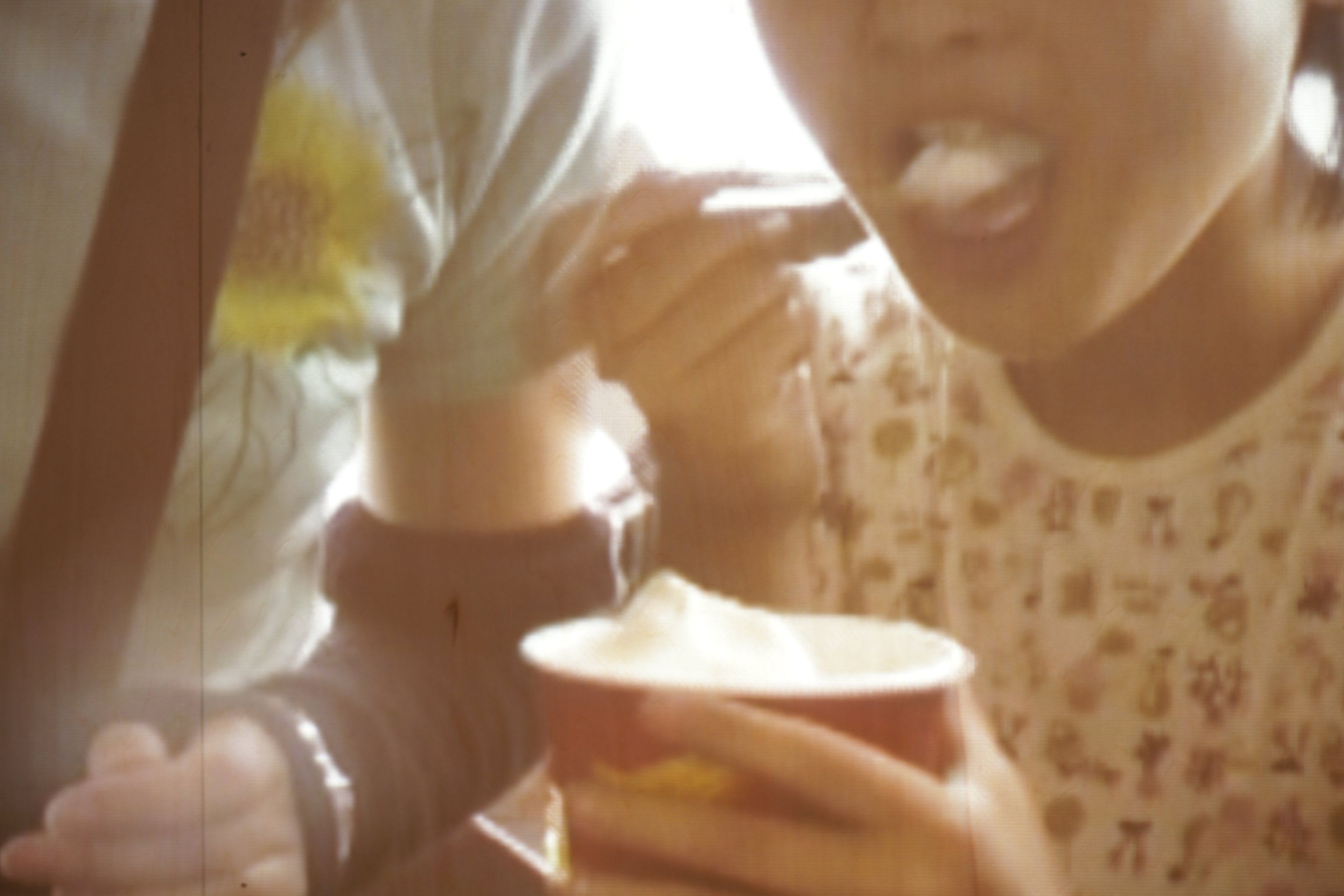
Photo © Kenshu Shintsubo
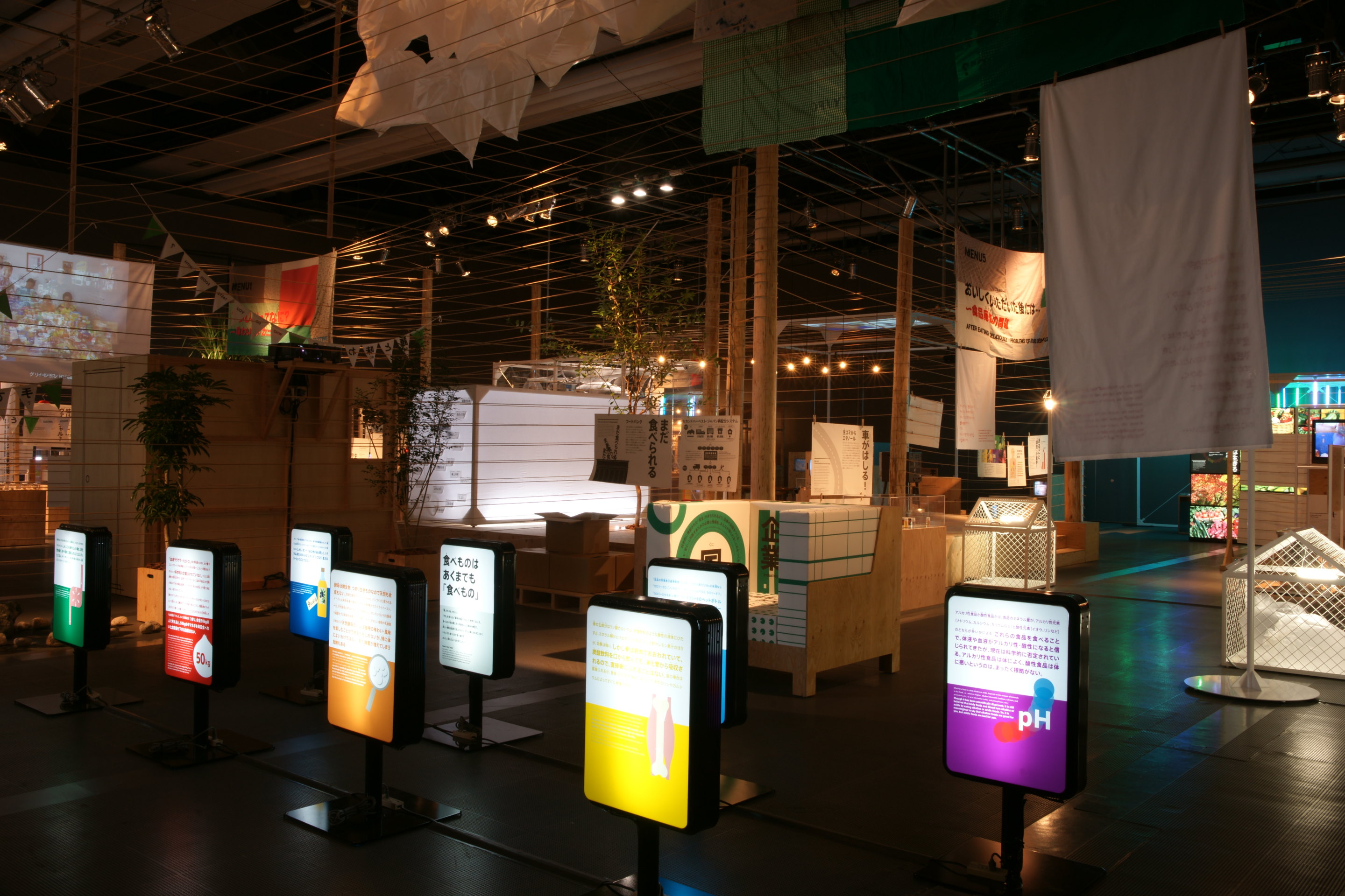
Photo © Kenshu Shintsubo
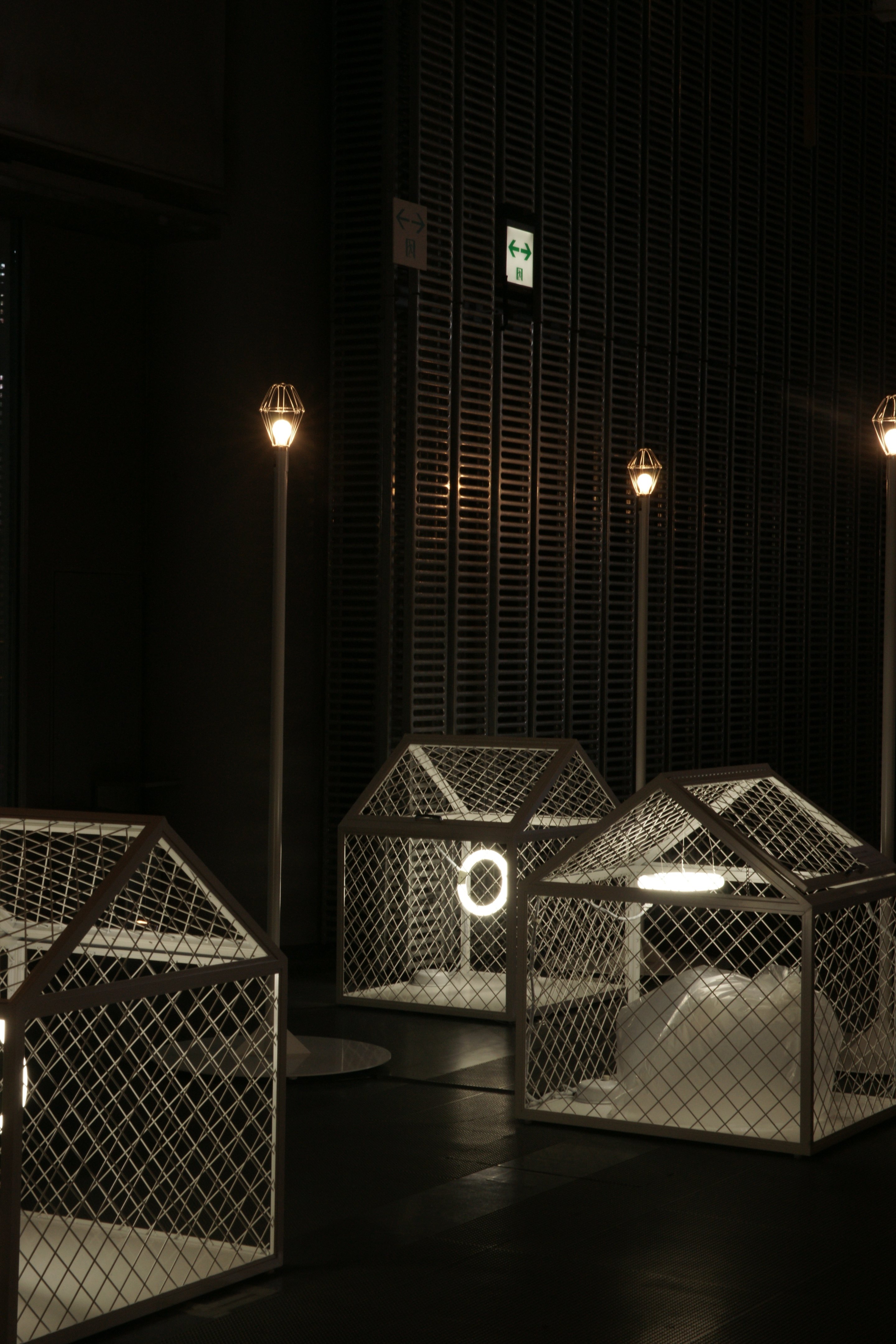
Photo © Kenshu Shintsubo
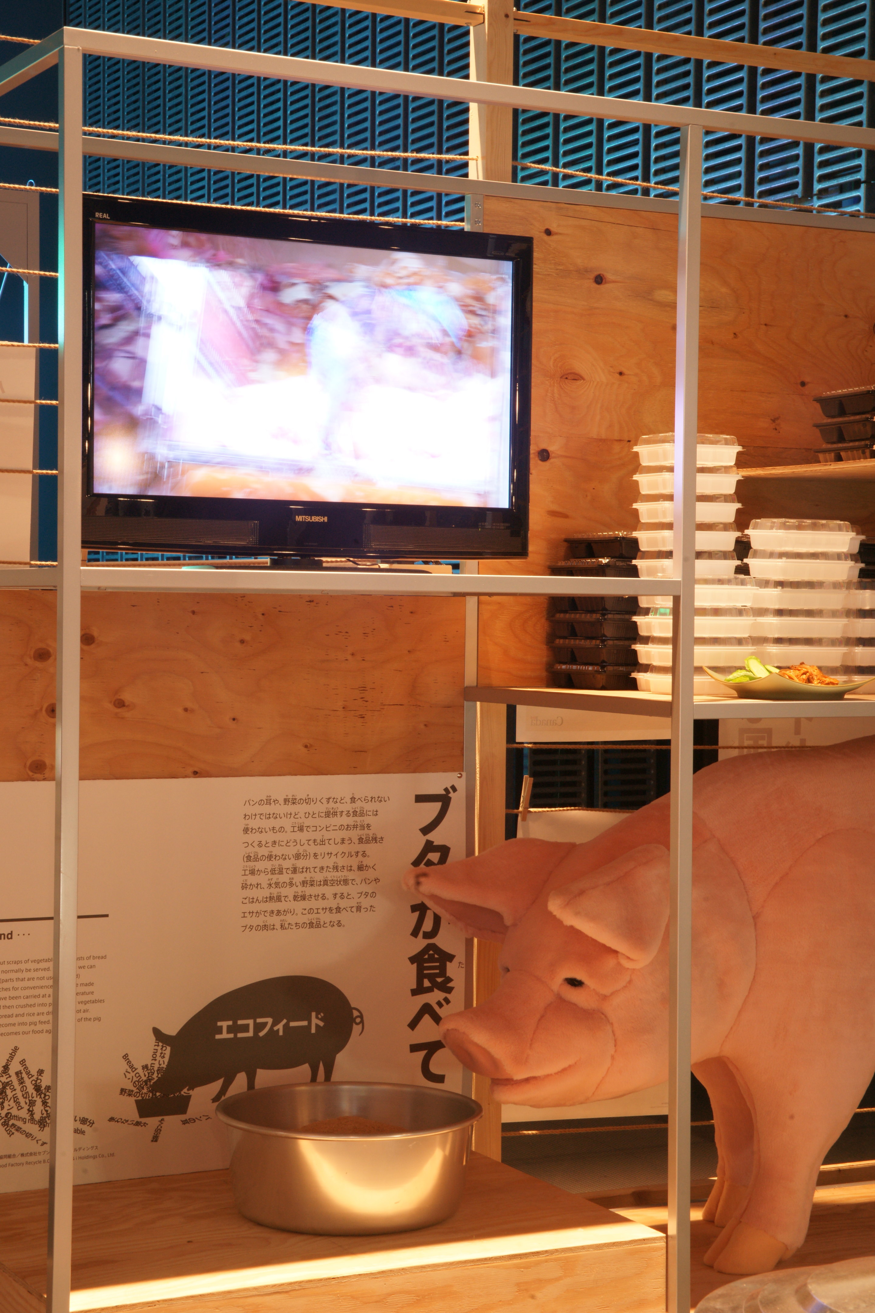
Photo © Kenshu Shintsubo
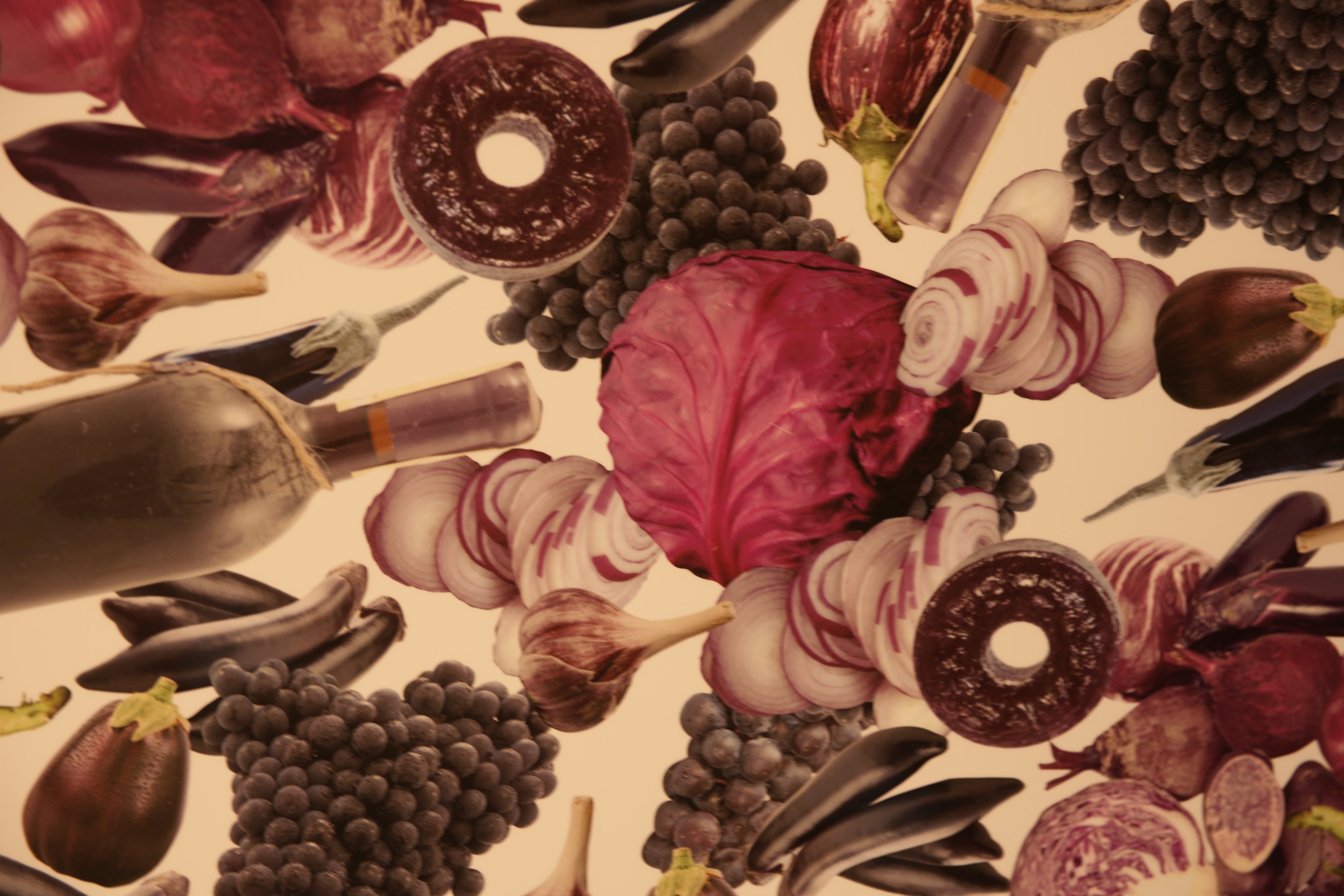
Photo © Kenshu Shintsubo
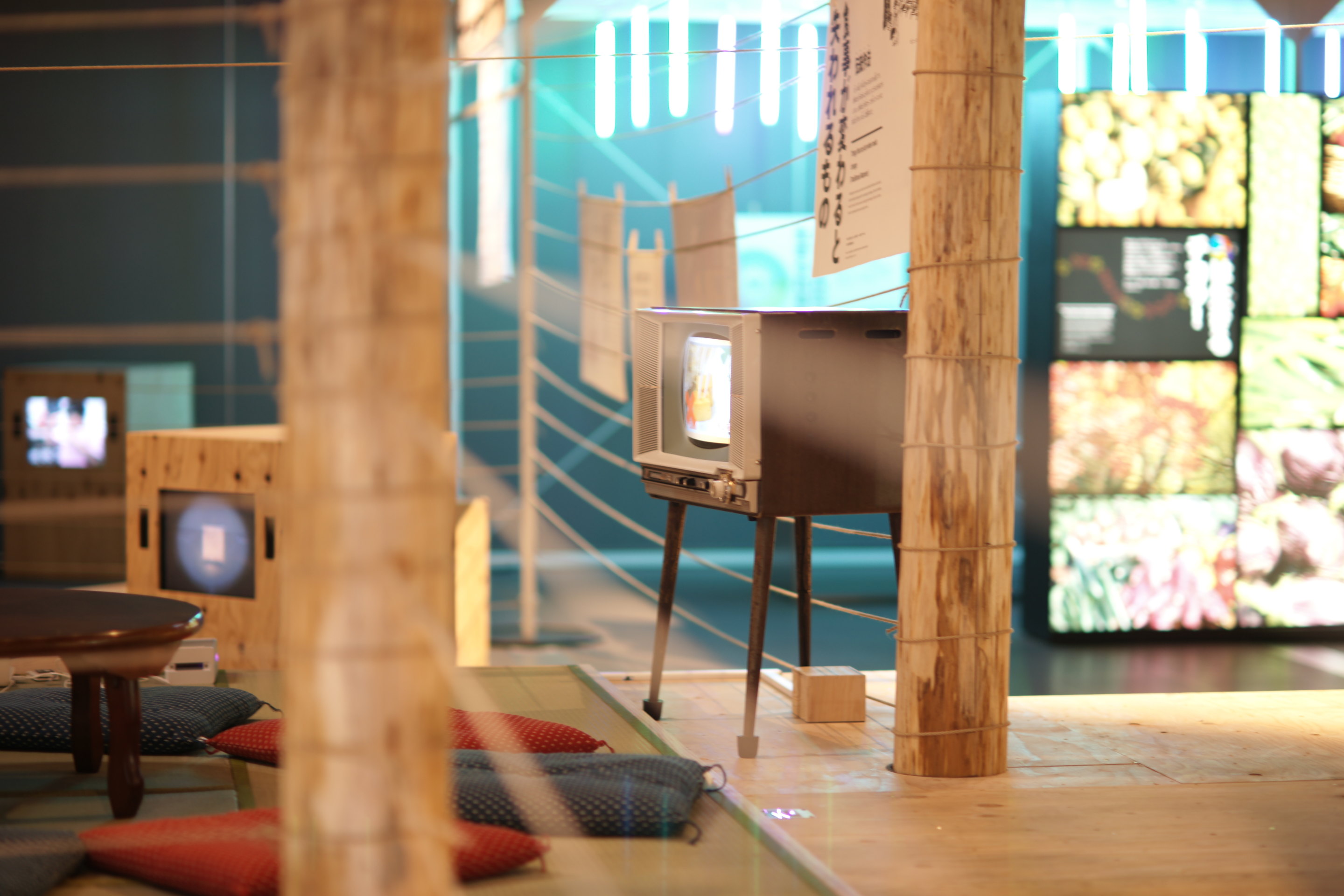
Photo © Kenshu Shintsubo
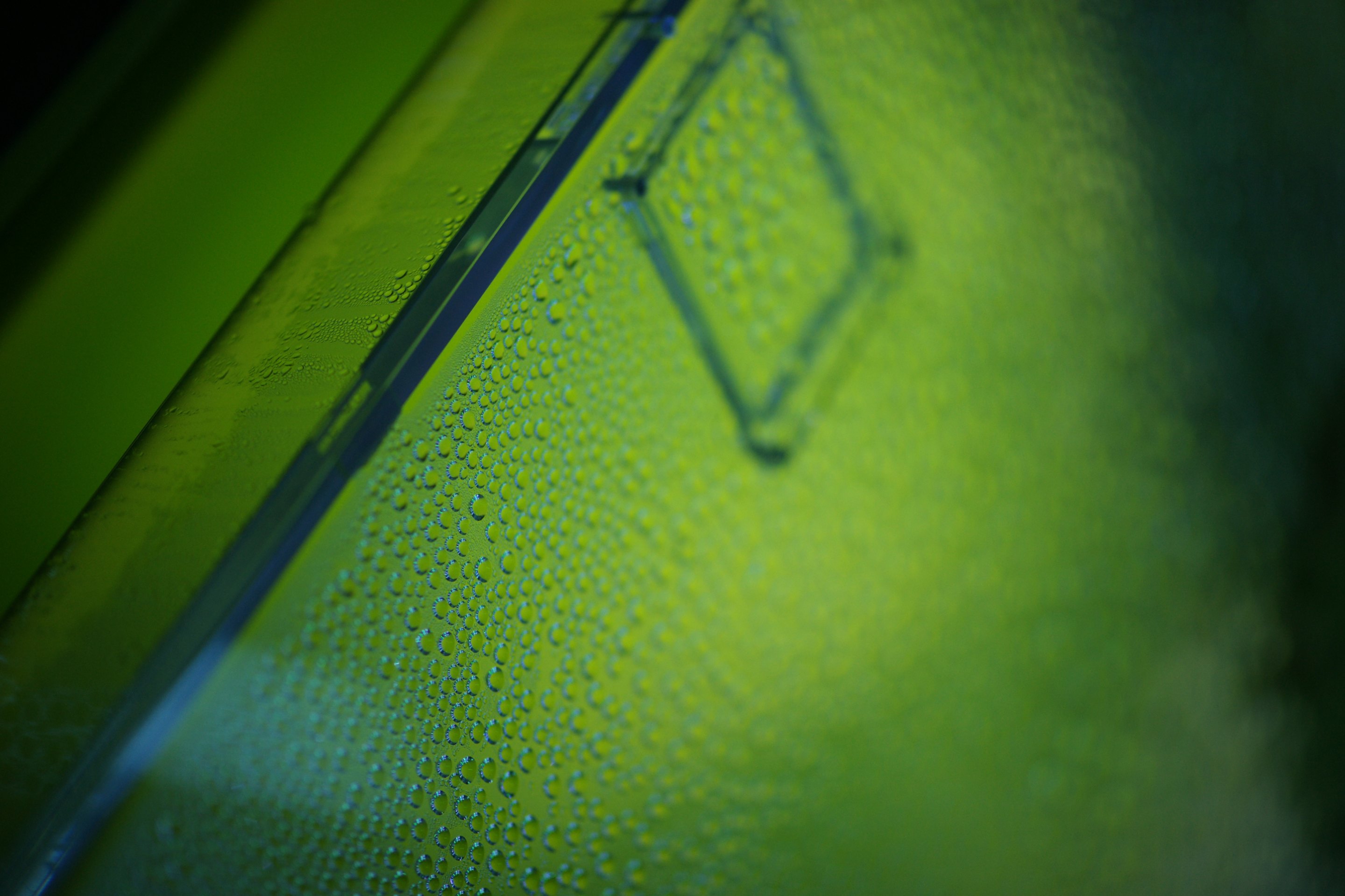
Photo © Kenshu Shintsubo
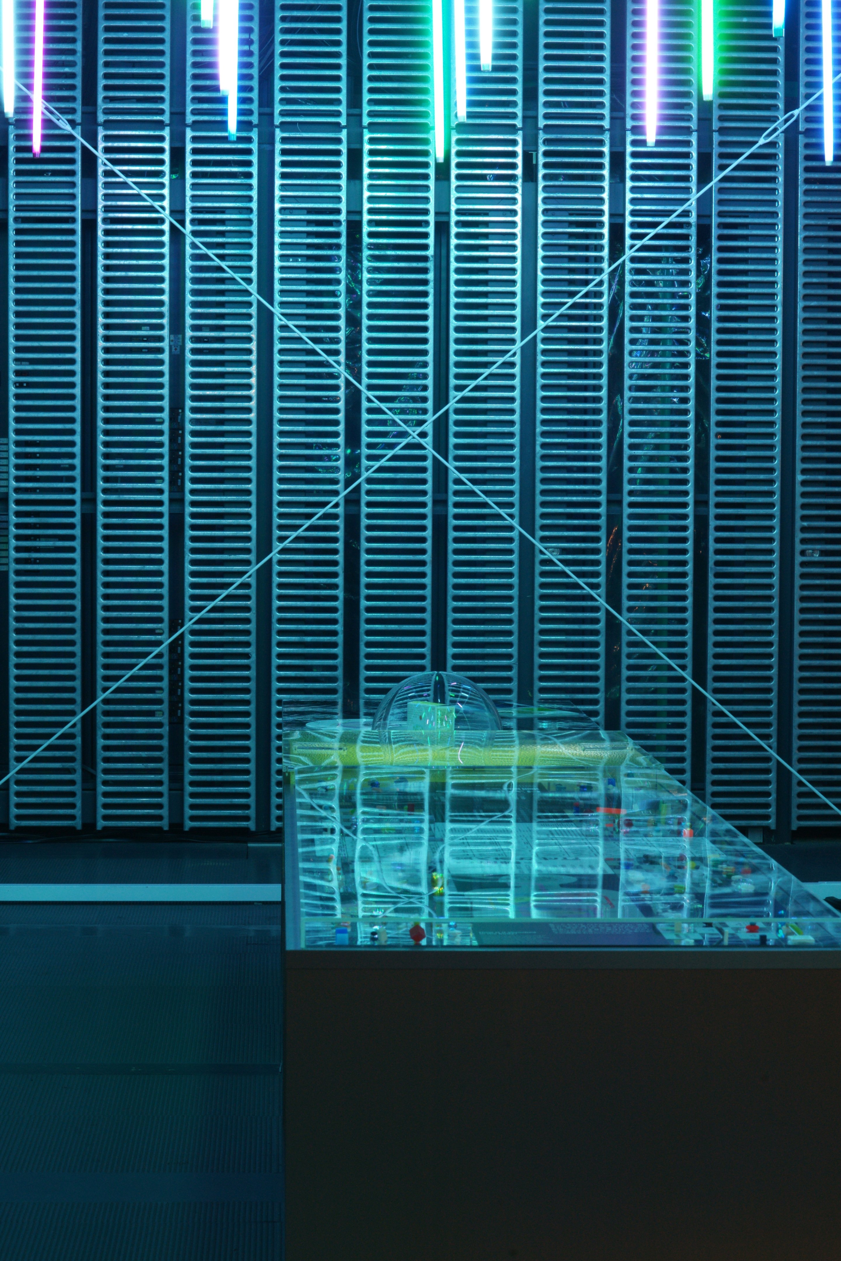
Photo © Kenshu Shintsubo
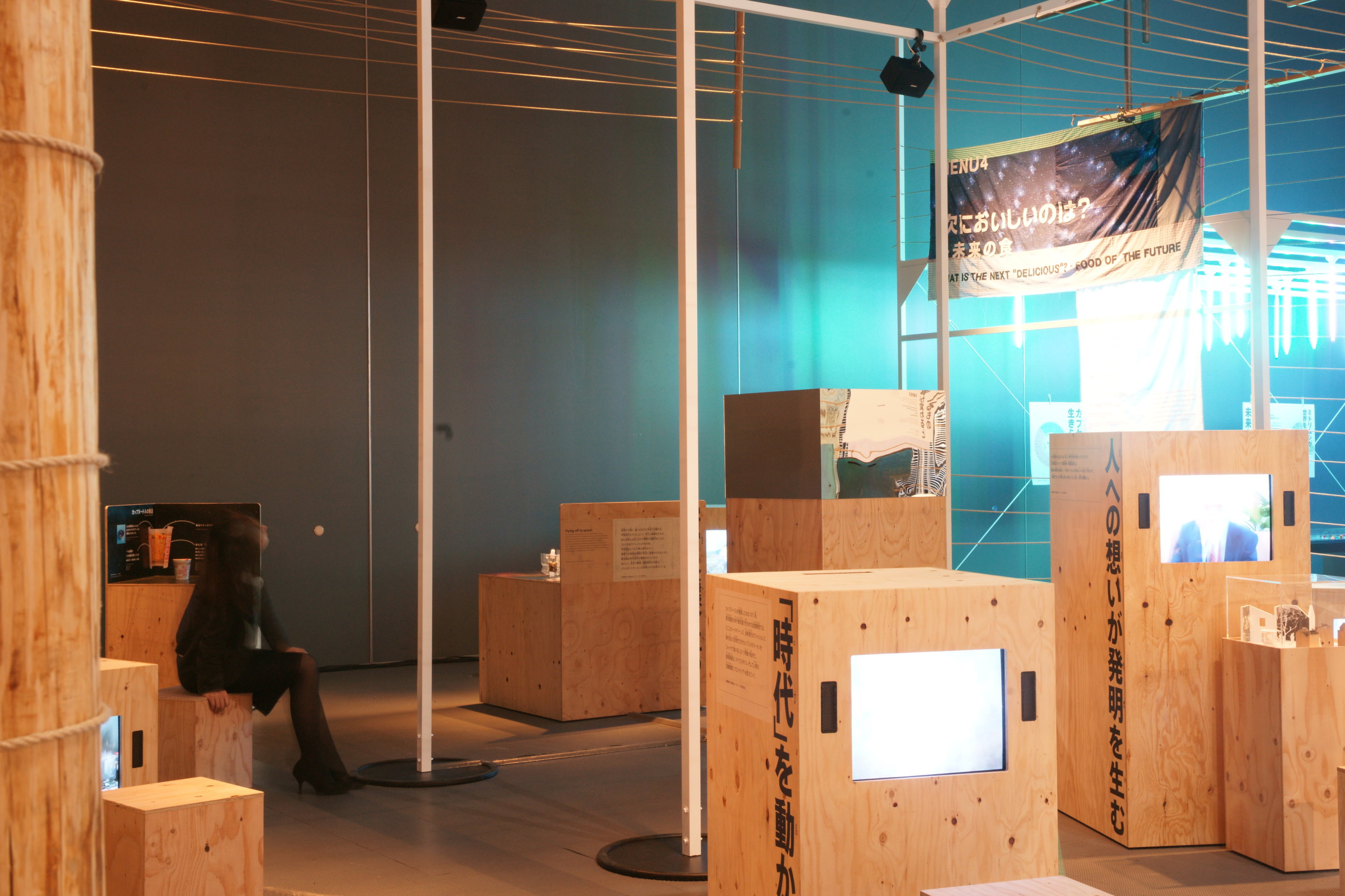
Photo © Kenshu Shintsubo
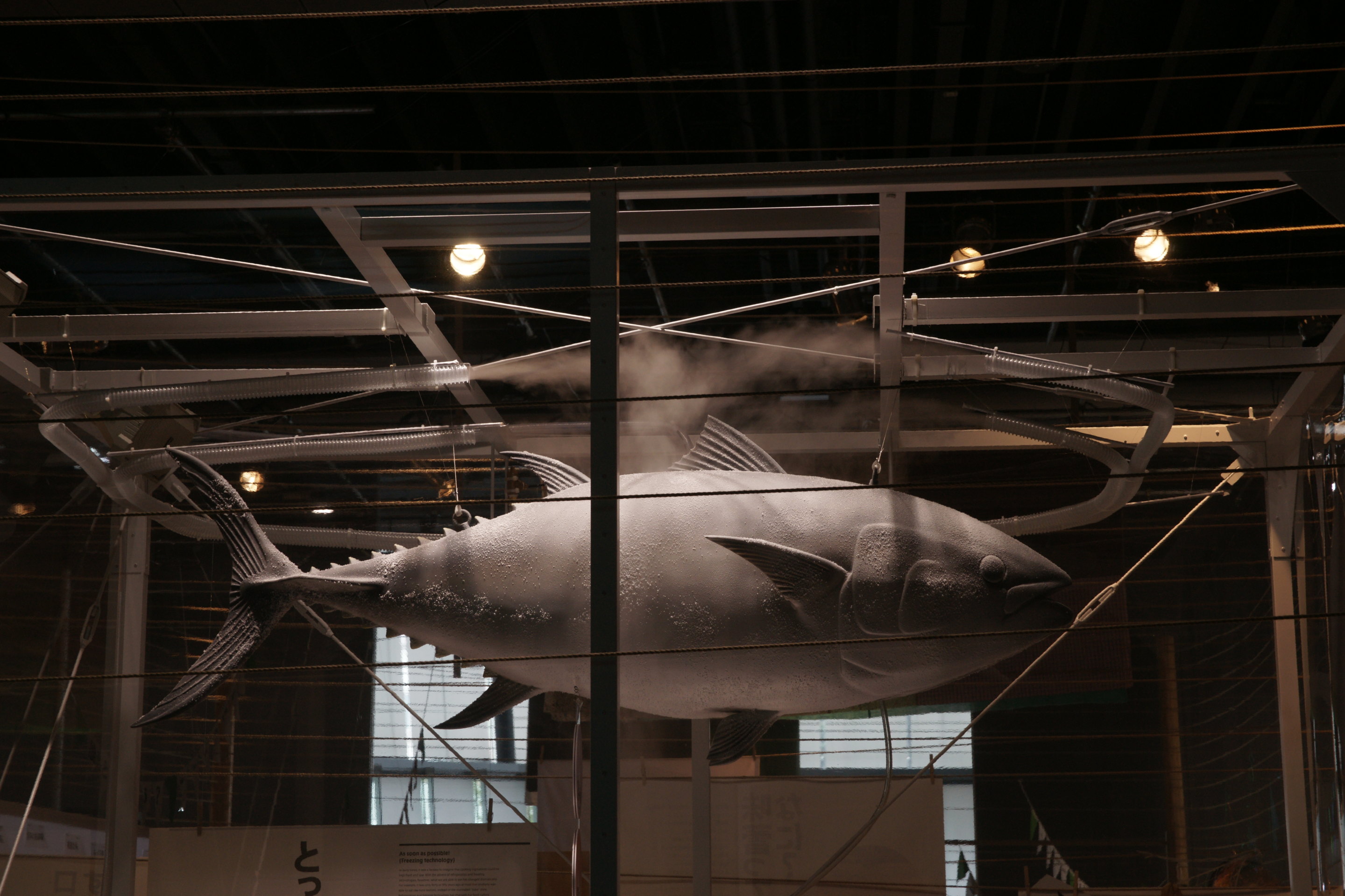
Photo © Kenshu Shintsubo
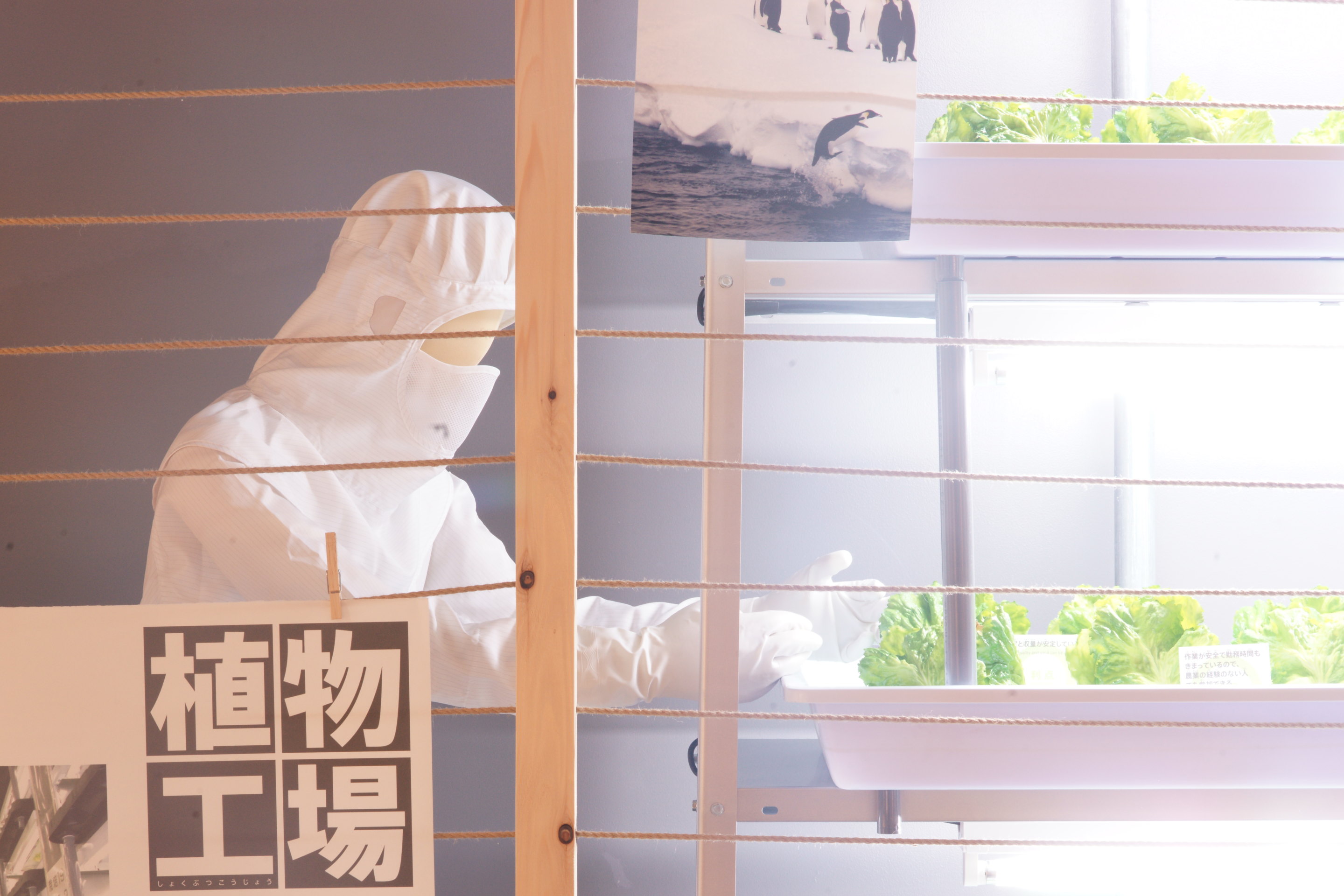
Photo © Kenshu Shintsubo
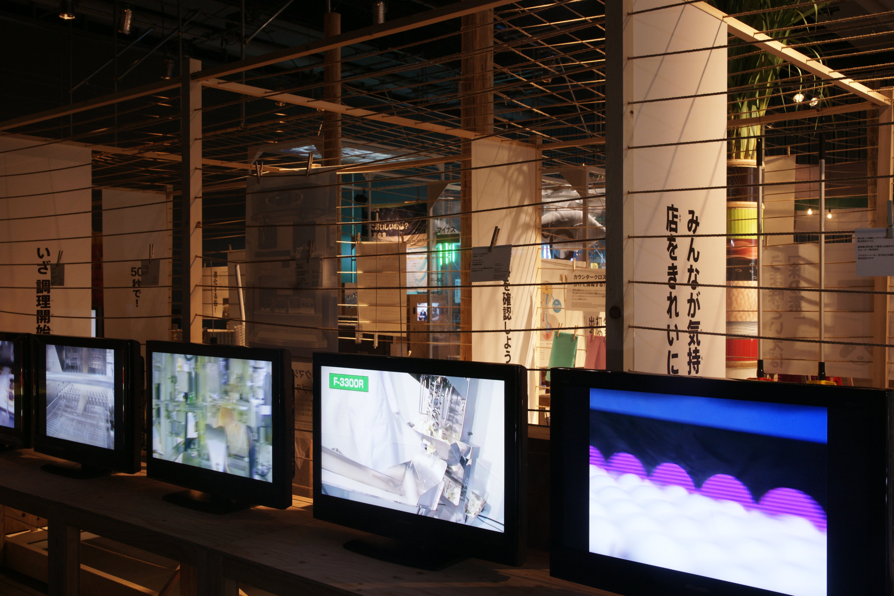
Photo © Kenshu Shintsubo
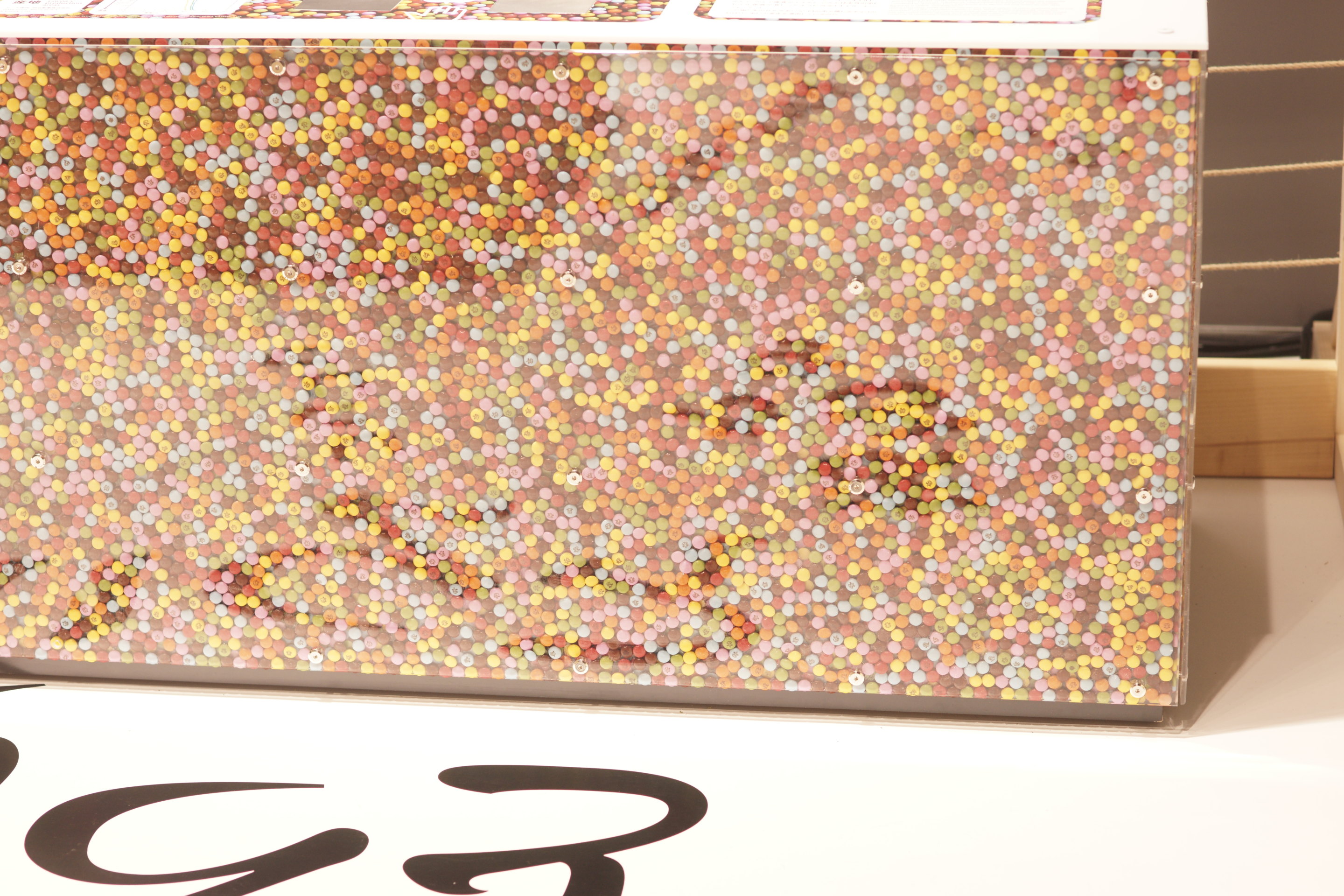
Photo © Kenshu Shintsubo
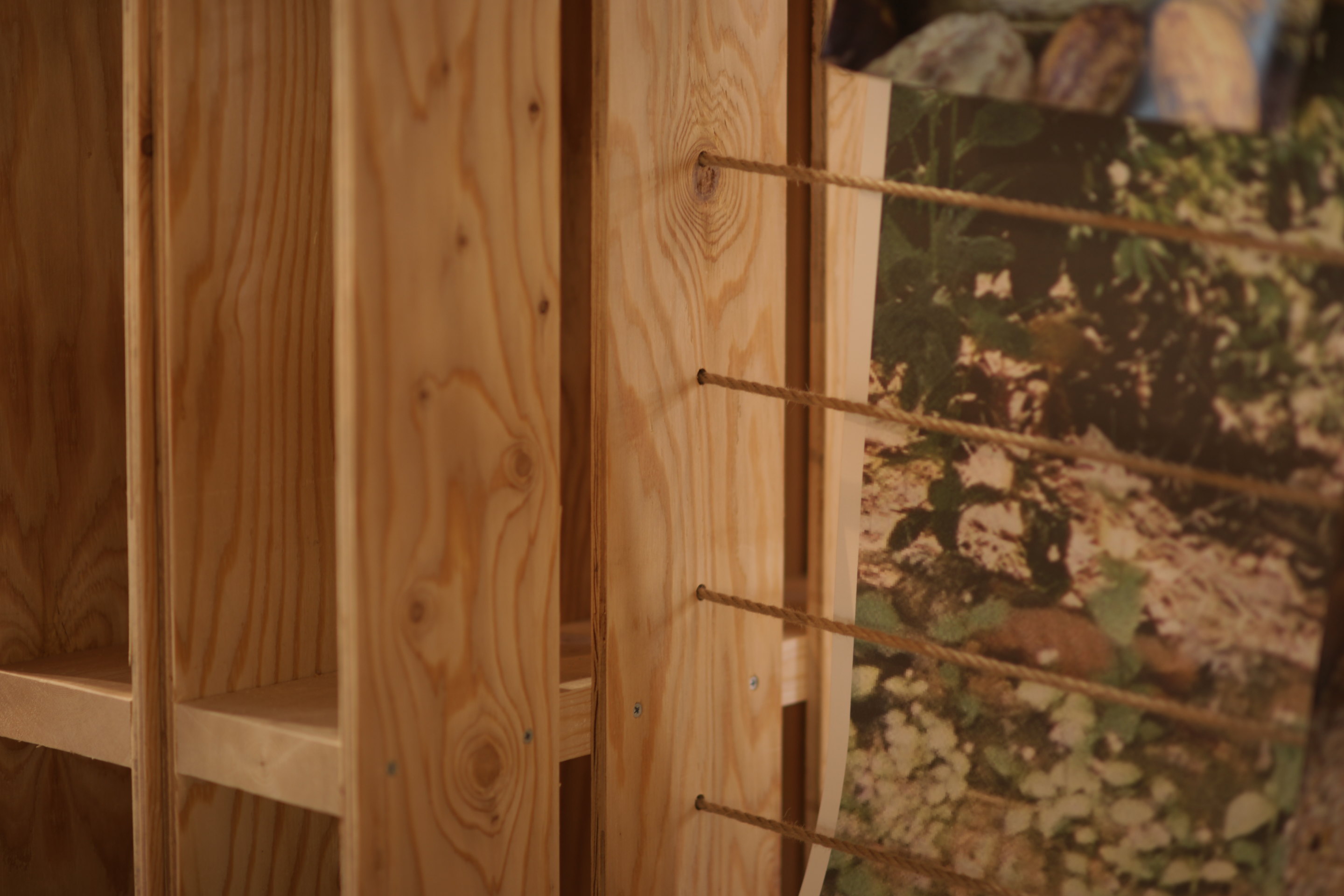
Photo © Kenshu Shintsubo
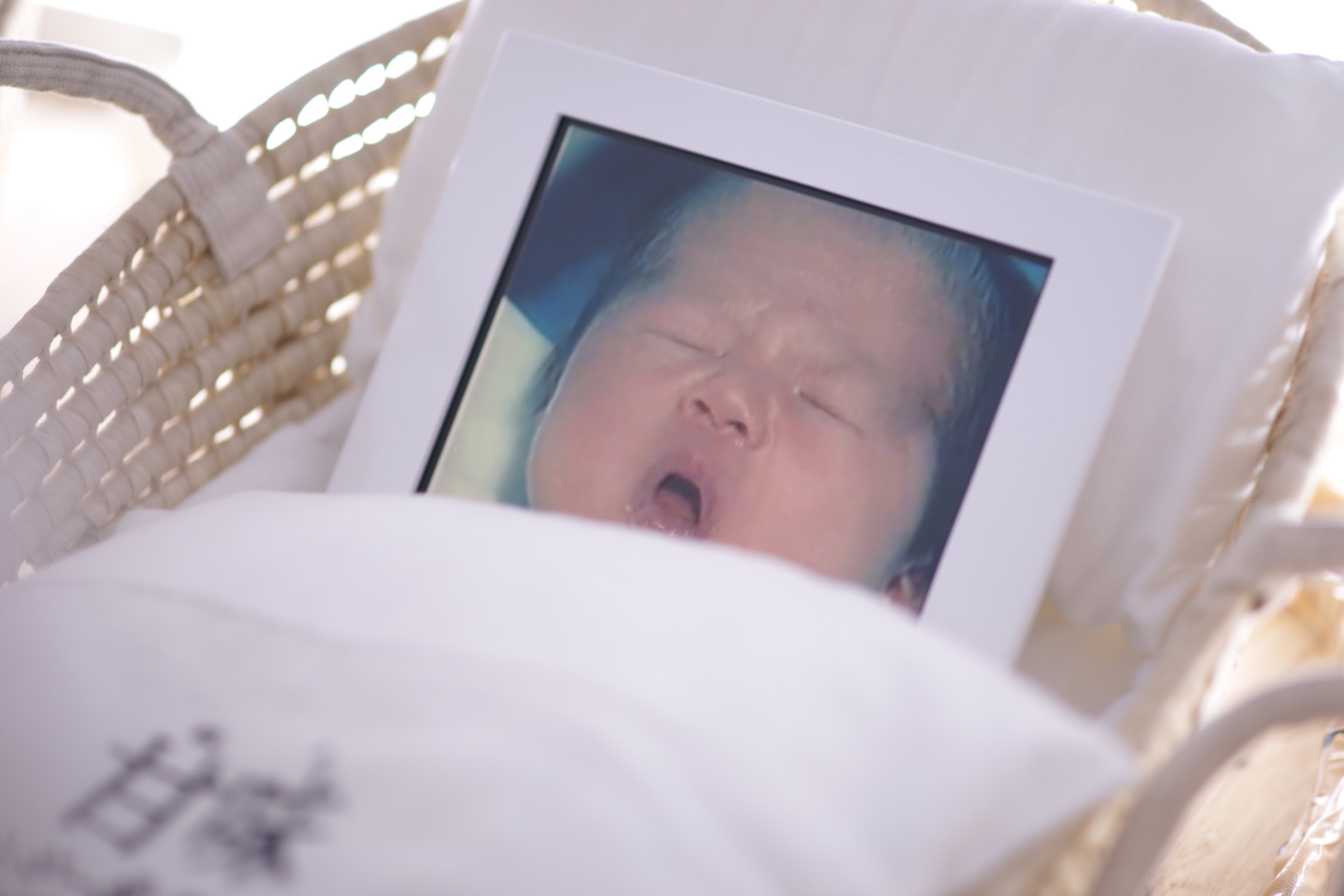
Photo © Kenshu Shintsubo
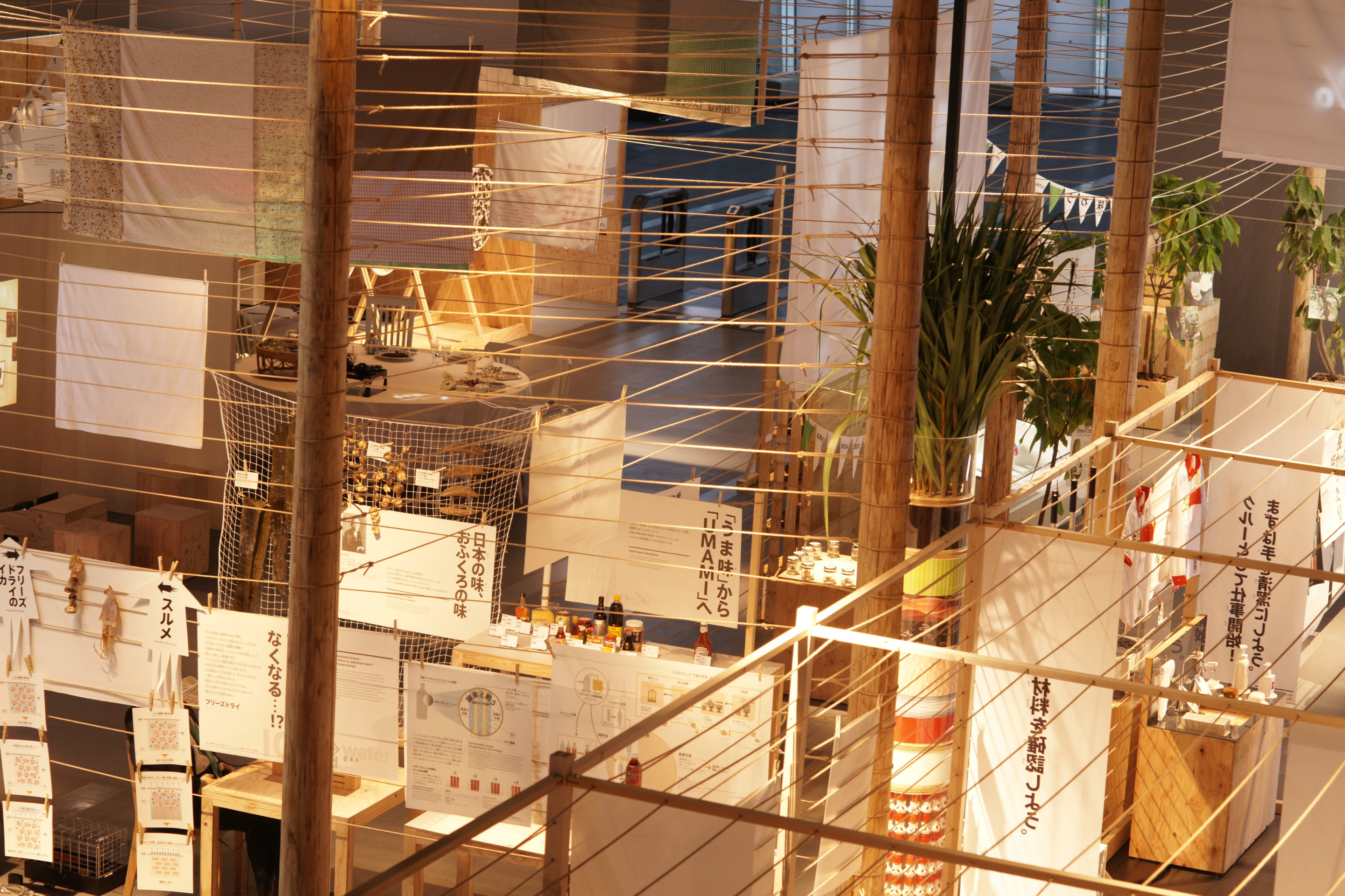
Photo © Kenshu Shintsubo
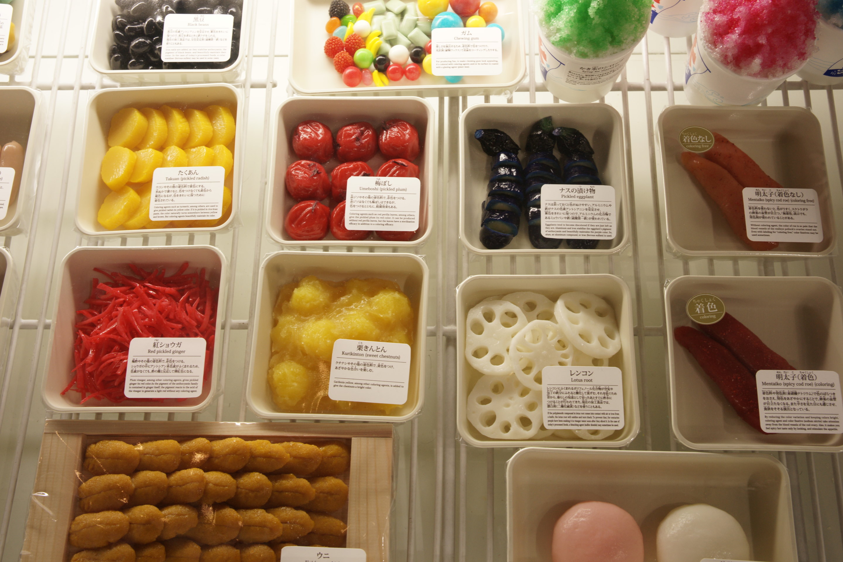
Photo © Kenshu Shintsubo
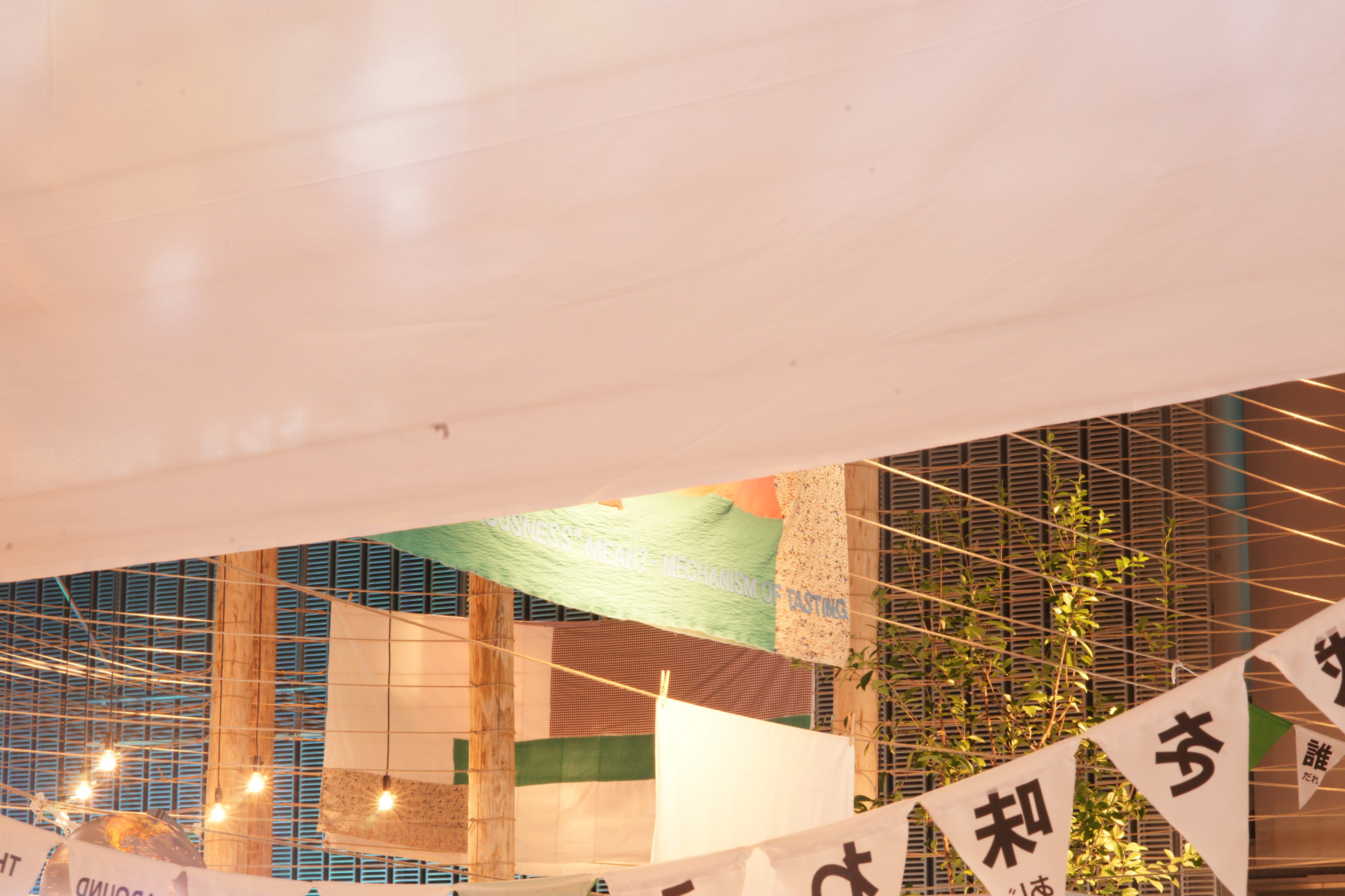
Photo © Kenshu Shintsubo
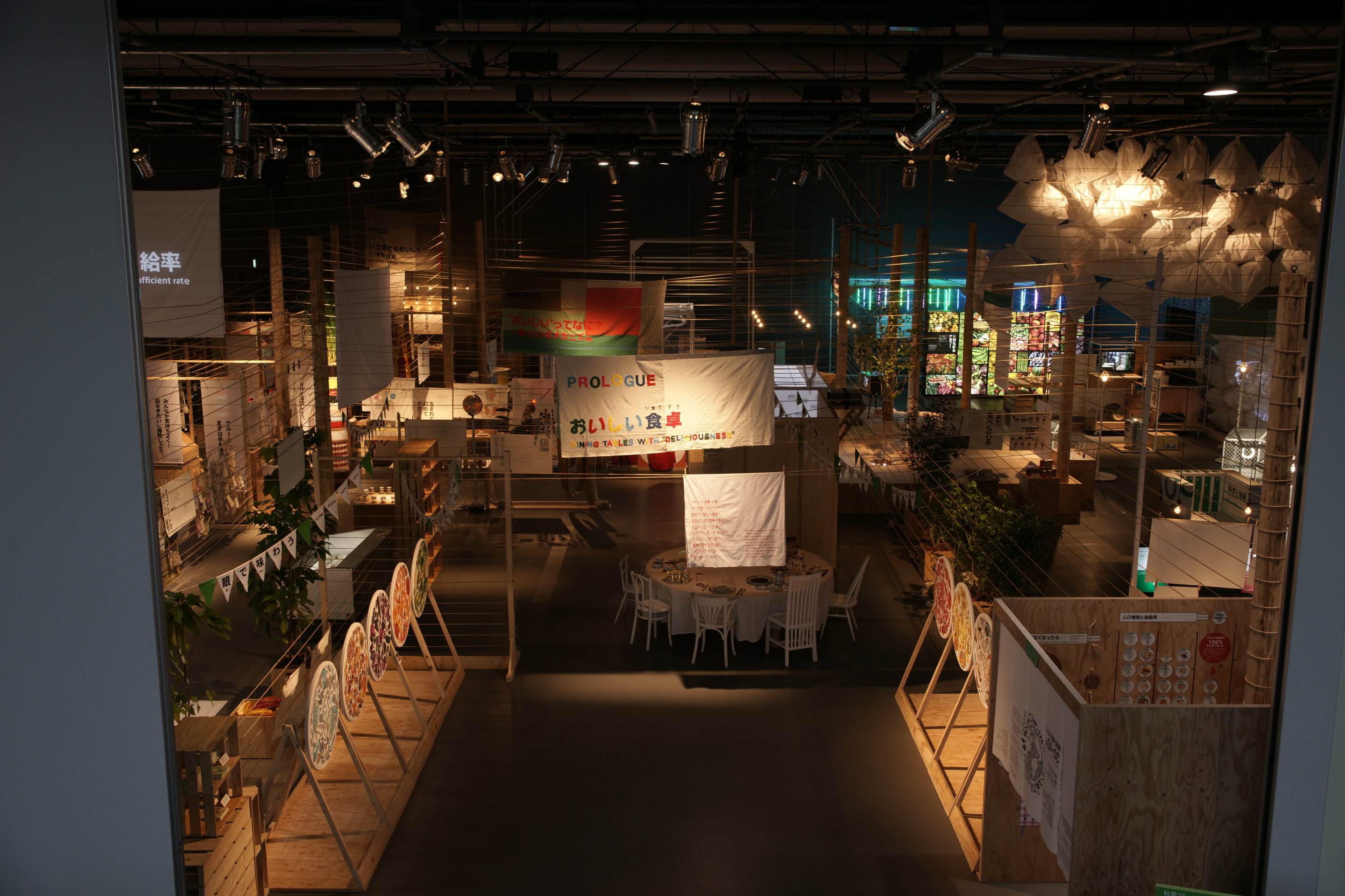
Photo © Kenshu Shintsubo

Photo © Kenshu Shintsubo
